I often receive quite a few questions asking me about my particular spin on colourimetry, pictures, and vision, from folks who have completely erroneously decided that I have even the remotest handle on any of this nonsense.
More often than not, the value of these questions result in my learning more through these sorts of dialectical interactions than I would not have without the nudge. The depth of insight that some of the questions exhibit can be remarkably high. Some even shake the foundation of previously held beliefs. I figured it might be nice to take a break from the regular question format, and offer up whatever nonsense is stirring in my brain as a result of interactions with other humans.
This particular batch of totally non-narrative and unstructured thought is generated from Miguel Pozas Pérez, who posted a pretty great comment here. The following is a body of text that I’ve been wanting to dump for the longest time, but haven’t felt an appropriate juncture to dive into it. Given that it is never “the right time”, why not now?
Note that while the title is posed as a question, I don’t have an answer. The answer is up to you in this case…
I imagine you mean absolute luminance (L)?
Miguel
Luminance is effectively a metric in the quasi-neurophysiological model of colourimetry. I say “quasi-neurophysical” because the model’s projection is a human construct that relates to cone sensitivities, but is anchored in a projection of infinite Grassmann additivity. Don’t believe me though, listen to four of the highest order experts in the field currently:
A standard photopic luminosity function should define luminosity over a wide range of conditions that differ in luminance and chromaticity, but this requirement is inherently impossible for a single function. Strictly, the V* (λ) function defines luminance only for the conditions under which it was measured and is not simply generalizable to other conditions of adaptation or viewing. Unlike cone spectral sensitivities, the shape of the luminosity function changes with chromatic adaptation (e.g., De Vries, 1948; Eisner & MacLeod, 1981) and is highly dependent on the observing conditions (e.g., size, retinal eccentricity, duration and intensity of the viewing field) and the measurement criterion.
A luminous efficiency function, V*(1), for daylight adaptation, by Sharpe, Stockman, Jagla, and Jägle, 2005.
Now think about this, if Sharpe, Stockman, Jagla, and Jägle, are informing us as to how nonsensical and impossible a singular metric axis of luminance is… and the fundamental base unit scale in our CIE Standard Observer colourimetric models is this exact singular axis luminous efficacy function… well… you make up your own conclusions as to the fundamental veracity of colourimetry itself…
With respect to the originating question however, luminance is a uniform-with-respect-to-relative-current relative metric projection under the two CIE standards, based on either the 1924 amalgamation of experimental data, or the later physiological cone fundamental derived basis for the 2015. The relative luminance Y of the CIE Standard Observers is entirely relative, and as a result, the flaws regarding “colour” begin to rear their head even here. Perhaps the most offensive framing of “colour” here is the insidious idea that “colour” is “caused” by radiometric energy. Arguably a bit more of a psychologically focused vantage might lens our understanding in a more fruitful direction.
That said, you have indeed spotted a very unique nuance via L*; the relative nature. We’d do well to clearly distinguish between absolute and relative units in our discussions.
Then again this would connect with Tone mapping, that if I have understood properly is the process in which we map the absolute Luminance (L) to the relative Luminance(Y) (relative to the chosen Display)
Miguel
As above; the photometric definition underlying CIE Standard Observer colourimetry is indeed relative. That doesn’t prohibit us from discussing things in “absolute” terms, but rather that no such caveat is placed on the colourimetry that is derived from the colourmetry fit to a digital camera’s quantal catches, or the colourimetry formed from a render; those quantities are almost always relative.
More than that, colour does not exist outside of us, and as such, any world view that attempts to sell someone on the idea that colour does exist outside of us, is fatally flawed and misinformation. Even treading along this path might be considered to be an ideology based on inference, and leads us directly into the following discussion. What measurement of luminance is important? Is it important at all? Relative to what? The great “Oops… wrong domain” error.
In the end all of this colourimetry mumbo jumbo is completely thrown out when we are discussing photography and rendering. In both cases, a fact which remains an inconvenient truth to folks who want to peddle notions of “scene” to the unwitting masses.
I disagree fundamentally with the conception of “mapping luminance” in terms of picture making, however. I can think of no greater blight on the surface of our understanding than the seductive idea presented in such a seemingly trivial thought. Not the specifics of luminance, per se, but the more broader idea of “mapping”…
To begin, the question of “mapping” is fraught with peril merely at the utterance. Why? I want to forward a wildly unpopular and controversial opinion…
We are not communing with the God of the Scene when making a picture. We are also not “presenting“, “capturing“, “relaying“, or “conveying” a “scene” in terms of a simulacrum. Again, these ideas are so prevalent in our modern mindset of picture-making, and so utterly seductive that very few folks have given even a passing thought to the veracity of the claim. In fact, most fail to even see a claim. So let me be clear…
I firmly believe a picture is not “about” a mythical “scene”. A picture exists as a text, and exists unto itself. Texts are read.
Yours Truly
No really. And we can hammer the counterpoint to measurement nonsense home with a really basic and simple reality of our current digital camera landscape. It goes like this:
- A digital camera gathers up magnitudes of quanta based on an already Standard Observer adjacent filtration model. The filtration is not arbitrary, and rather an engineered set of three filters that are a Goldilocks balance between a characterization that “matches” a given Standard Observer cone absorption characteristic, and noise.
- A digital camera’s quantal catches are then formed into colourimetry, and as all good readers know by now, that means the model is photometry based. Typically, this might be a minimization fitting, but could entail any formula to “Align this magnitude to this known magnitude”.
- Great! Now we are done right? Would it surprise you if I stated that not a single digital camera in the world has ever presented this colourimetry to the audience? Not. A. Single. One? This isn’t an engineering oversight. The reason is that if we present the colourimetry as best as possible as a picture, the picture appears flatly “uncanny”. That’s right… the colourimetry, as best measured, when replicated on a display medium, looks weird as f*ck.
If you are capable, and don’t believe this, try it at home. Take the fit colourimetry and try to render it accurately as tristimulus out of a display medium. There will inevitably be a sealion who will come out of the water to try and suggest “Well we have measurement error!!!11!” and so on. I want to assure the sealions that this is not the case…
It should be noted that many researchers have noted the peculiarity of picture versus measurement over the years. Some incredibly wise folks I know have recounted stories of performing, with highly accurate measuring tools, this same idea of measuring the “scene” and replicating it on a display, more recently, in the modern era. It is perplexing and fascinating!
To delve into this historically documented phenomena, have a read of MacAdam, time travelling from 1951, following Judd and many others before him, to relay a message to us in the future:
First, optimum reproduction of skin color is not “exact” reproduction. The print represented by the point closest to the square (“exact reproduction”) is rejected almost unanimously as “beefy.” On the other hand, when the print of highest acceptance is masked and compared with the original subject, it seems quite pale.
[…]
The discrepancy between “exact” reproduction and preferred reproduction is partly due to distortions inherent in the process, such that a certain discrepancy of a particular color is necessary to permit the best overall reproduction of all colors in the picture. But, as discussed in the case of monochrome reproduction, it must also be due to differences of the conditions of observation, or of the observer and his attitudes when observing pictures and when observing real objects. Certainly, no such discrepancies should be introduced by a picture window in your living room, nor by a mirror in your dressing room. In such a case, we usually consider that we are looking at the “real thing.” Perhaps the farther we get from that attitude, the greater the discrepancy becomes. Perhaps wishful thinking is partly responsible, with or without the acquiescence of fading memory. Certainly, differences of adaptation must play some part, but, for the ordinary range of adapting conditions when viewing scenes and pictures, this cannot account for more than a small fraction of the discrepancy shown in Fig. 11. Whatever the causes, the discrepancy is real, and is typical of the conditions under which photographic portraits are viewed.
Quality of Color Reproduction, MacAdam, 1951. Emphasis mine.
Whatever is happening within the idea of a picture’s surface, it is likely that the relative luminance of the medium plays a strong role in determining what is attempting to be communicated. But this is framed from the concept of the picture’s luminance, not the “scene’s” luminance. Specifically, as noted in Quality of Color Reproduction and other research, we must diverge, and create a new range of luminance, from the “exact” reproduction in order to achieve a barely acceptable picture. Where “acceptable” here is “Not look f*cking weird as sh*t”.
Hence we can return to the notion of a “mapping” from the “scene” as fundamentally problematic. At best, the luminance present in a render or a camera’s fit colourimetry is but one of many potential ingredients of a much larger recipe that forms a picture. It might be more wise to think of terms like forming, or shaping, or constructing, a picture, as opposed to “mapping”, which implicitly privileges the “input” over the “output”. In doing so, we incorrectly frame a “scene” as the input, and the picture as an output. The picture is the input, and the hero of this story.
For anyone willing to do the research, the notion of “scene” is bunk. And as a result, “mapping” is bunk too…
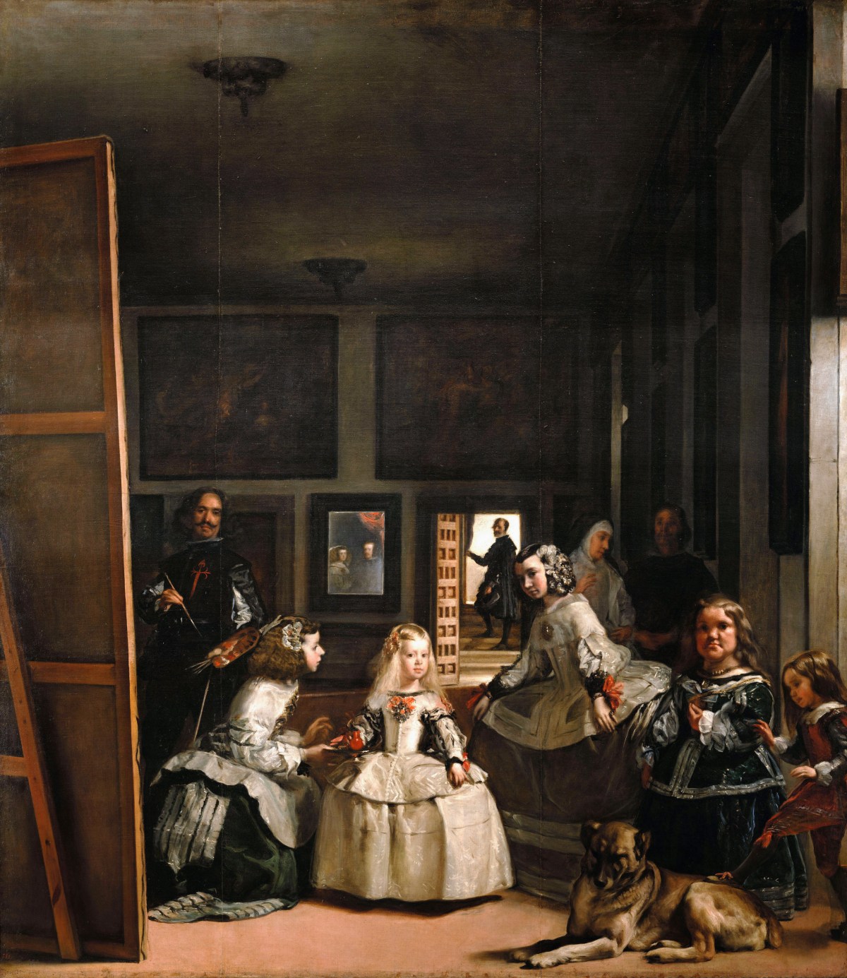
To highlight this fatally seductive notion, the following picture from Picasso is insightful. Vision researchers have used examples in art to showcase their understanding, and this particular piece has been used by Dr. Margaret S. Livingstone in several of her presentations. If you haven’t seen her presentations, they are well worth the time invested.

If we take a step back, we can consider looking at the things presented before us in this discussion under a slightly different lensing. We can divide this investigation loosely into regions of “sameness” and regions of “otherness”, and the difference between them as “surfaces”.
We have the top level surface that forms and frames the continuity of “sameness” and “otherness” within whatever computer operating system “windows” we are using, as you read this ridiculously crap post. Within each surface, there are further nested subdivisions of sameness and otherness. Somewhere in this dance, meaning is formed.
This idea of forming information from the visual articulation of elements can be described using Gestaltian conceptual frameworks. Within the browser surface, regions of “text” manifest, plausibly defined by the gradient of difference of luminance between the “ground” and the “figure” of the glyphs themselves. Already, even at this juncture, we should be able to get a handle on the “thing”, in terms of the computer display we are looking at right now, as an incredibly complex series of relationships and cognition to form meaning from the discrete parts!
Within the gathering of the “things” in this crappy web page, we have some mind-bendingly complex cognitive processing, that has shaped the information and meaning of the surfaces of text, and then… “something else”. We might label that Picasso above as “something else”; an image or picture. Whatever it is, is strictly a psychological construct. Why strictly psychological?
Assuming your browser’s surrounding “ground” value, chroma, and hue, is different to the Picasso’s “figure” surround, the gradient of difference between the belongingness of the “ground” to the belongingness of the picture’s “figure” is read as information; “This is something else or other”. We can get a sense of another surface within the higher level surface of this post. And we start this whole nested process of cognition of “belongingness” or “other” all over again.
Note that even if the background of the computer surface matched the surface of the Picasso in terms of brightness, we’d still have some cues from the variations in the lines themselves, their lack of continuation both along the line widths, but also their termination points along their lengths, that shapes the idea of a collection of belongingness. A bundle of lines that belong together as a figure, and are other to the ground.
Now the million dollar question? Is this related to “scene”? The answer is as clear as the question is absurd… Of course not. The lines form a visual language, derived from differences in luminance and other psychological mechanisms, that the author employs as text. We, the audience, read the text. Visual literacy in authorship, an attempt at information communication, and ultimately audience reading.
The readership can probably imagine a “layering” up the Picasso in their own work without much exertion. Perhaps they add subtle gradations. Perhaps varying chroma and hue. The point here is, it is trivial to exert a mental force to obliterate any notion of a demarcation line between what we are looking at in the Picasso picture-text, to a more variegated / articulated “realistic” version in a new picture-text. The idea that any of the pictures we might imagine along this continuum of lower articulation versus higher articulation “represents a scene” is pure unadulterated horsesh*t.
There is no demarcation, because again, a picture does not “map” a “scene”. It is not a “representation”. It is not a “mapping” in the sense of “scene” to picture, but rather of something else that lives higher up the order of cognition!
“It doesn’t do you any good to transmit a high resolution image to your visual cortex because there is nobody up there to look at an image.”
Dr. Margaret S. Livingstone
We have further evidence from other researchers to support this idea of image-as-text. In doing so, we can reframe and reject the idea of “mapping” in terms of relaying the open domain colourimetric luminance to a display, as per the original question. Here is a passage from Dr. Melville J. Herskovits in the book The Influence of Culture on Visual Perception:
I have had an experience of this kind, similar to that reported from many parts of the world by those who have had occasion to show photographs to persons who had never seen a photograph before. To those of us accustomed to the idiom of the realism of the photographic lens, the degree of conventionalization that inheres in even the clearest, most accurate photograph, is something of a shock. For, in truth, even the clearest photograph is a convention; a translation of a three- dimensional subject into two dimensions, with color transmuted into shades of black and white. In the instance to which I refer, a Bush Negro woman turned a photograph of her own son this way and that, in attempting to make sense out of the shadings of greys on the piece of paper she held. It was only when the details of the photograph were pointed out to her that she was able to perceive the subject.
The Influence of Culture on Visual Perception, Segall, Campbell, Herskovits, 1966. Emphasis mine.
And in another field entirely? James. J. Gibson has been considered one of the more important figures in the field of visual perception. Unsurprisingly, he wrote at least five pieces on the subject of pictures. Consider the following thought, from the beginning of his treatise The Ecological Approach to the Visual Perception of Pictures:
Having rejected the picture theory of natural perception we can make a start on picture perception. To see the environment is to extract information from the ambient array of light. What is it, then, to see a picture of something? The information in ambient light does not consist of forms and colors but of invariants. Is it implied that the information in a picture does not consist of forms and colors but of invariants? That sounds very odd, for we suppose that a picture is entirely composed of forms and colors.
The kind of vision we get from pictures is harder to understand than the kind we get from ambient light, not easier. It should be considered at the end of a treatise on perception, not at the beginning. It cannot be omitted, for pictures are an essential part of human life as much as words. They are deeply puzzling and endlessly interesting. What are pictures and what do they do for us?
The Ecological Approach to the Visual Perception of Pictures, Gibson, 1978. Emphasis mine.
What we can begin to see for those willing to look across disciplines, is that the subject of “picture” is incredibly complex. Far more complex than the buffoonery that shills “scene” and “display”. Perhaps we’d do well to focus on this distinction as we are tasked with engineering them from the electronically engineered machines.
Does the “pre picture formation” stage relate to the “electromagnetic radiation quantities” and the “post picture formation” relate to the “RGB observer based colourimetry/tristimulus model”?
Miguel
Make no mistake, colourimetry is photometry. That is, we’ve lost all notions of the electromagnetic model we might label as radiometry. Both photometry and radiometry are human-centric metrics, with photometry buried deeply in a fragmented concept of vision, and specifically, the opponent mechanisms in our visual pathways.
What I think your question is asking is how to reconcile or draw a parallel understanding that is workable for image authors in 2023 and onward. How can we think about the open domain tristimulus of a render or a camera’s colourimetric magnitudes in a way that affords utility to the image author? How can she empower the model to greater understanding and control?
With the caveat in place that we are always photometric once in a tristimulus system model, I believe there is a general paradigm that can aid understanding in terms of the pre and post picture formation stages. Further, I’d go so far as to say that some creative aspects of picture manipulation cannot exist in the singular silo that quite a few minds are parroting of “scene”.
We can think of the pre-picture open domain tristimulus as a photometric based quantity of the components in front of a film camera or painter’s canvas. Why do I use a film camera and a painter’s canvas here? Because it is a closer projection to how we formed pictures prior.
To the painter, the thing humans have framed as “electromagnetic radiation” is shaped into information in the painter’s cognition, coupled with the complex act of forming meaning, and written to a specific medium using specific tools. A painter doesn’t simply “map” values, hues, and chroma, but rather creates an information stream on the canvas. The same goes for film, which in no way “ideally” reproduced the electromagnetic energy, but rather shaped fundamentally new energy in the complex photochemical reactions. Is the pre-picture open domain tristimulus equivalent then, to electromagnetic energy? No! It’s just a loose mental parallel. Again, we are photometric the moment we speak of colourimetry, and that can happen very early on in a chain.
We can think of the post-picture closed domain tristimulus as the picture formed. At least as an entry point, or interstitial stage. For example, when we photograph with black and white film, we may desire the picture formed from the mosaic of occluding material entirely as achromatic gradations of tone as an entry point to the picture we want as a final image. Perhaps we seek to push the “contrast” of the formed picture, but we would be manipulating the values relative to the picture, not relative to the open domain tristimulus in the pre-picture domain.
With “creative adjustments” do you mean the Tone Map for example?Which operations should happen in the “pre picture formation” stage and which ones in the “post picture formation” stage?
Miguel
A simple example might be a sphere illuminated with a light that appears deep blue, on a table. Perhaps we want to increase the illumination level falling on the sphere to increase the ratio of surface illuminance to the shadow in the penumbra and umbra region. But all of this takes a back seat to the actual picture making process of the film or the painting, which will require a very sophisticated interaction with the medium to form the picture. Imagine for example, we set our black and white camera to be +4 log2 units above baseline exposure, or we purposefully choose to barely paint any density on the canvas. We’d expect a “dreamy” sort of a picture, and it is completely detached from the act of “standing there”. Again… the densities of a picture are a text, requiring an active reader!
Likewise, it is equally possible that you, as the picture author, wants to create a sensibility of a green tint to the black and white picture. Here, placing a gel that appears deep green in front of the light of the still life is ridiculous, as the primary picture formation is devoid of the ability to create a sensation of chroma. However, many folks did indeed tint the picture, and in fact this is the earliest origins of the role that we commonly refer to as colourist in the modern era; folks, mostly women, would paint or dye the formed picture. With the introduction of layered dye film, the colourists would weaponise the printer lights to shape the colours of the picture of the picture. So here, we could use the black and white dream-like picture as an interstitial picture, and fill the gradations with a dye that yields a green sensation.
This is a perfect example of something that is impossible with the brain wormed vantage of “scene” or the idea of “standing there” as a baseline of a picture. This is nonsense, and there is a good wealth of research from many folks on this subject. No amount of simulacrum of “standing there” results in the green, dream-like toned monochrome image we produced in the example above. No black and white sensation is possible from standing there.
Instead, we’ve create a visual language of tones and chroma, designed to be read by another human, detached from the notion of the simulacrum of standing there, observing a “scene”.
Regarding the gamut mapping extra explanation, you have in GitHub, I am not sure what you mean by “chromatic attenuation” and “crosstalk” and I haven’t been successful finding information on the topic except for some engineering definitions that I couldn’t make a lot of use of. Where could I get a bit of literature on this topic?
Miguel
The concept of the interrelationships of the dyes in creative film is absolutely critical with respect to the pictures formed. Some naive folks have suggested that we are in a “more advanced” place with contemporary digital imaging, and nothing could be further from the truth. We are literally sitting in an era of slapping a per channel curve on some values, with a grave lack of the depth of image engineering that the behemoths of imaging such as Fuji or Kodak invested significant energy and research into.
To understand an overly simplistic view of the idea of “attenuation”, we should start again with a black and white picture.
In the simplest explanation, a thin coating of photosensitive material of a specific spectral sensitivity characterization, is layered onto plastic. When light hits the photosensitive material, the molecule enters into a charged state. This is then coupled to a granule of occluding material, and we end up with a mosaic. The density of the gradation from fully occluding material to no material varies along a uniquely engineered density curve, involving a good degree of chemical manipulation and control to achieve.
That rate of change is what folks would see plotted in the classic Hurter and Driffield sensitometric work, and densitometric curves. Remember, we push light through these surfaces, so the medium is attenuating the light’s intensity according to the film’s engineering. We are seeing something that evaluates and considers the bulb’s light in a print or a projection.
Now pretend for a moment that we change the black and white mosaic of occluding material to granules of dye of a given thickness. At maximal density, we have less to no light coming through, and deeply pure dye thickness. As we move up the exposure axis, the density attenuates, and the dye layer becomes less pure, and more bulb is revealed. If we were to look at a visual sweep of the dye increments, we could say that we’d see blackness, then a deep and dark colour, then a less deep and more bright colour, until we end up with no colour, and maximal brightness of the bulb.
If we couple this further to the next iteration of complexity, we would have two dye layers behaving in precisely the same general mechanical way, except the unique mechanic that occurs between them is easily overlooked. As one dye layer attenuates and depletes in density, dependent upon the spectral absorptive characterization of the photosensitive layer, the other layer may be less attenuated. That is, the purity of the one layer depletes, while the other layer in fact increases in purity.
What we end up with is a very unique and complex pushing and pulling of what we ultimately experience as chroma coupled to value. As we go down in exposure, the densities are thicker, and lower light passes through, lowering the sensation of chroma while holding high purity from the technical vantage. Then in a middling range of the material, we have light passage through semi-attenuated layers, resulting in a “bowling out” strengthening or “depletion” of hues and chroma, depending on the composition. Finally, as we ascend up the density chart, we traverse into less and less density across all three layers, yielding the push-pull chroma mechanic all the way up the range. When all dye layers are fully attenuated, we are left with nothing but the projector bulb, and no chroma, but maximal brightness of the achromatic bulb.
The interplay of the dye layers is commonly referred to as “crosstalk”, or the way that dye layers are interlinked; the signal has a crossover. Couple this facet with the reality that the spectral absorptive profile of the sensitivity layer was different to the spectral profile of the projective dye layer, and we have a very unique set of transformations happening in the picture formation chain. None of which are even remotely simple to model.
To visualize this sort of interesting “flight” path projected into a chromaticity projection, we can look at the complex flights of paints. Dr. David Briggs graciously provided a sample from Pigment Handbook, Volume 3: Characterization and Physical Relationships, Second Edition:
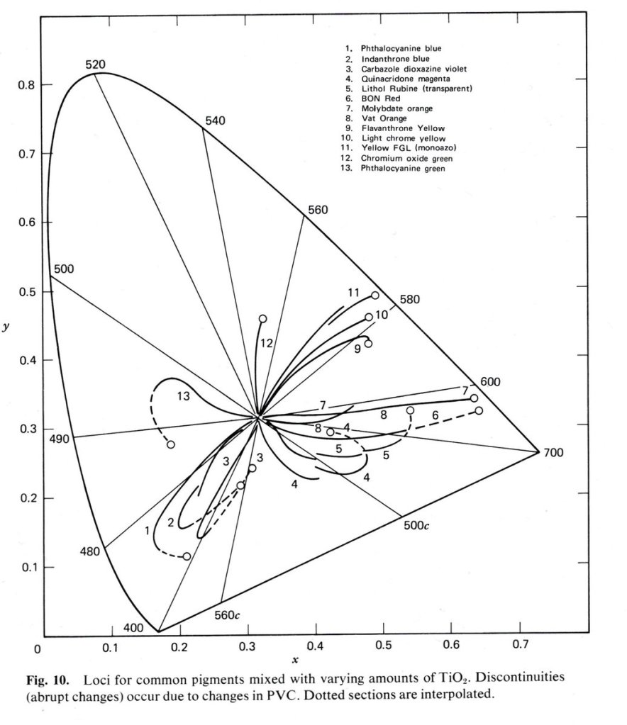
The unique “crosstalk” of the spectral components here are incredibly important to the final reading of a picture in terms of chroma, hue, and value. The result is deeper than “As a colour gets brighter… derp… it goes to white!” In fact, the two dye example shows us that as one dye depletes, the other amplifies in purity, all along an axis of density that is maximum to minimum. Complex interactions of crosstalk frequently overlooked!
As with paints, the hue, value, and chroma of the dye layers all shift along the continuum of mixtures in a picture.
So where does this leave us? More questions than answers. It seemed that the questions here from Miguel were on point enough that the giant, huge, blinking “WAIT A MINUTE… THIS IS ALL GOING DOWN A ROAD OF NUMBER F*CKING!!1!!” sign could no longer be ignored. I’ve been wanting to segue into the more substantial stuff regarding pictures for too long, and sadly the narrative appeal of continuity consistently pushed it back and back.
So welcome to the rupture. Let’s see what you all think.
I should add that I get plenty of questions hidden behind the walls of private messages across different platforms. I also understand that very few folks appear to want to be seen asking a question openly, as though it is some sign of intellectual weakness or other deranged projection. This post is ultimately a question. What is a picture?
I have no f*cking clue. None.
Please ask more questions.
If you found this post intriguing, I would encourage you to visit a couple of posts that explore some of this surface in Question #34 and Question #35. We are setting the table for some fascinating research to examine…

8 replies on “Questions to the Editor #1: What the F*ck is a Picture?”
How the heck does color opponency work, and is it relevant to chemistry?
I ask because some chemistry textbooks have simplistic color wheels, and then say that looking at emissions, you can determine what wavelengths are being absorbed.
This sounds mostly like crock, but I can’t articulate why.
Prof disagrees and says it isn’t crock
LikeLike
It’s a great question. Perhaps worthy of a post.
The TL;DR, as best as I can tell, and given a vast spread of information on “vision” spans a *massive* range of domains, is that “vision” is about as elusive as leprechauns and unicorns.
I have found it tremendously useful to approach “What does vision do?” with an incredibly skeptical-with-respect-to-common-ideas healthy. There are a hundred seductive ideas, but few that manage to span across unique things such as reading textual glyphs etc.
The idea of “guessing wavelengths” is pure nonsense, however. Why is our vision only sensitive to a paper thin range of all electromagnetic energy? Does spectral composition matter for a drawing on a cave wall? How? Why? For reading text on a page? How? Why?
There’s a thousand questions here that scientism can’t begin to explain when framing things in a polemic of “outside to inside”.
LikeLike
Awesome! In understand that there is no such thing as “scene” because what we call “scene” isn’t but another interpretation in itself under very concrete and precise viewing or measuring conditions. As long as there is “us” we can’t access to any “scene” because weather it is the 3 dimensions reality or a 3D representation in a 2D surface, is already a construction in our heads. It is from (pre-)“picture” to (post-)“picture”. The objective here is trying to sell as best as we can the second as a replica of the first one, which means successfully selling a 3D representation over a 2D surface. The old Zeuxis and Parrhasius tale.
> What measurement of luminance is important? Is it important at all? Relative to what? The great “Oops… wrong domain” error.
But the question remains: how does the picture we see from “reality” correlate with the picture we build in any 2D display? We still want to take this “absolute” luminance out of the CIE function that comes from the pre-picture to match the Display’s “relative” luminance. What is the math behind this?
Based on the first article article you mention, would it make sense to calculate a Luminance for each different shot then? What are the benefits of the Luminance V*(λ) proposed in the article, if as they say, it is also limited?
The illusion of 3D space over a 2D surface in film, painting… has been successfully achieved for centuries now, and if I understood properly, this perspective that rejects the “scene” aims precisely to those successfully achieved illusions as part of our ineludible human interpretation, rather than seeking for the “real” from a “scene”.
> Instead, we’ve create a visual language of tones and chroma, designed to be read by another human, detached from the notion of the simulacrum of standing there, observing a “scene”.
> We can think of the pre-picture open domain tristimulus as a photometric based quantity of the components in front of a film camera or painter’s canvas. Why do I use a film camera and a painter’s canvas here? Because it is a closer projection to how we formed pictures prior.
I guess this could also be a freshly rendered .exr. In one of the various answers, you gave to my endless questions you said that software such as Nuke are built solely around workflow in the pre-image state, and it is normally here where people do all the grading.
> We can think of the post-picture closed domain tristimulus as the picture formed. At least as an entry point, or interstitial stage. For example, when we photograph with black and white film, we may desire the picture formed from the mosaic of occluding material entirely as achromatic gradations of tone as an entry point to the picture we want as a final image. Perhaps we seek to push the “contrast” of the formed picture, but we would be manipulating the values relative to the picture, not relative to the open domain tristimulus in the pre-picture domain.
When you say “push the contrast” you don’t have grading process in mind right? What is the difference between pushing the contrast in the grading process relative to open domain tristimulus in the pre-picture domain and pushing the contrast of the formed picture? Is there a particular math for that “pushing the contrast” of the formed picture?
I remember reading some generic literature about vision where Anya Hurlbert raises Leonardo’s topic about shapes vs colour in the vision process, as to which one contributes more to our visual understanding of the world. I understand that the “scene” deicide works both for colour and shapes. The latter also depend on luminance, focal length, depth of field, lens distortion… Modifying these conditions we might recognize some shapes and others not, and when doing so we are aware of the human visual standards to produce alike images. In various Oliver Sack’s books, he describes harmed visual systems that for example impede people “understanding” that someone that is getting further away from them isn’t getting smaller. But for some reason, there seems to be no issue -at least not of the same magnitude- with shape reproduction. I guess the nature of colour can be trickier and more elusive than that of shapes, that are clearer to us, and maybe they do contribute more than colour in our visual comprehension of the world.
Thanks once again for your answers. I need to do a bit more reading before asking more questions regarding the “crosstalk” topic.
LikeLike
> But the question remains: how does the picture we see from “reality” correlate with the picture we build in any 2D display?
This is the great and mighty question, and my answer inevitably is “I reckon we are thinking about the problem incorrectly if the goal is to create a picture and we are conflating it with ‘What we see when standing somewhere’”. It leads to too many red herrings that, when tested for veracity, fail us.
> We still want to take this “absolute” luminance out of the CIE function that comes from the pre-picture to match the Display’s “relative” luminance. What is the math behind this?
No, as researched rather extensively at the turn of the 20th century by L. A. Jones. Jones noted that the “preferred” picture had distinct trends away from the “ideal” reproduction, extending beyond simple adaptation conditions.
> The illusion of 3D space over a 2D surface in film, painting… has been successfully achieved for centuries now
Except any good vision expert will tell you that looking at a 2D projection, even if done “correctly”, is a far cry from an ecological perception anchored in being-ness. Further, more than a few experienced artists will echo this claim.
Conventions all the way down.
> What is the difference between pushing the contrast in the grading process relative to open domain tristimulus in the pre-picture domain and pushing the contrast of the formed picture?
The response of the picture forming shapes the resulting density of values in the picture. The signal becomes fundamentally distorted in unique ways. Think of a “blue” object at high exposure, among some other objects. The resulting density that occurs through the complexity of a given picture formation chain will yield the “What we see” contrast. I do not believe it is possible to derive an equivalence, by pushing convoluted distortions to the open domain tristimulus. Better still, when we flip to *colour*, the contrast is of the post-formed, either chroma attenuated or amplified, ratios.
> I guess the nature of colour can be trickier and more elusive than that of shapes, that are clearer to us, and maybe they do contribute more than colour in our visual comprehension of the world.
I firmly believe that our picture-reading has nothing to do with “How we see things” but rather “How we think about things”.
That is, to suggest that reading a book creates a mental construct and then likening that construct to “What we see” is somewhat of a misplaced framework; the act of reading is entirely mental cognition and some massively complex things happening.
I strongly suspect this is very much a similar track to when we cognise pictures.
LikeLiked by 1 person
I think I have a different definition of “scene” – it’s the location in which I stood when I recorded the surrounding light of a particular instant. Now, I turn and walk away from that location/instant with some data and with my crappy tools go make a picture, now I’m in the realm of your angst here…
I just skimmed the post, interleaved with doing a 3D render of my steam locomotive with oh-so-slow tools, but I agree with your fundamental posit – we’re really just making stuff up with our photography. You go, girl…
LikeLike
> I think I have a different definition of “scene” – it’s the location in which I stood when I recorded the surrounding light of a particular instant.
Kodak has done this research.
A picture is **not** a “reproduction” of the stimulus. The research goes all the way back to Ives, follows through MacAdam, and has many crossovers to folks like Bartleson. Folks can be forgiven for thinking this, as even Judd, Balcom, and Plaza made this assumption mistake (again) in 1950!
Folks just need to read the research and ask themselves “What is a picture?”
I promise it has absolutely nothing to do with emulating or conveying a simulacrum of stimulus “in which I stood when I recorded the surrounding light”.
That’s the nonsense!
LikeLike
I’m not (well, don’t think I am..) arguing your posit – I know the measurements I capture with my camera really are a poor takeaway of the location and instant in which I took them. But don’t they form a “palette” with which I then “paint” to tell a story in the form of a picture?
LikeLike
There is a subtle tricky bit in this, in that most of our thinking around the subject in “contemporary” terms tends to privilege the “data” in the camera encoding.
If we were wiser, we’d flip our discussion around to the theoretical, fully-formed picture, and analyze the ways that it must be different. For example, a black and white “photograph” is an *incredibly* complex interaction of task-forward visual cognition. We do not *see* a black and white picture, so much as, from the very structural elements of frequencies present in the spatiotemporal articulation, **read** and *shape meaning* from the marks.
Under this picture-text lens, we can at least ask ourselves *how* we are reading the picture. *Why* do we expect value A to be of a higher luminance than value B? *What* mechanics are at work?
These questions are incredibly challenging, and I sadly do not believe there are enough discussions out there regarding them. There remains, at the basis of all of this, an incorrect assumption that the idealized picture is a simulacrum of the stimulus.
As best as I can tell, from all of the less than healthy amount of reading I’ve done up to this point on the subject, the a priori error of belief that a picture is “idealized” in the 1:1 simulacrum state, is completely false.
Understanding a picture-text as a form of literacy makes the above false belief rather self-evident. The the ways we cognize linguistic-texts would be hilarious if we tried to evaluate those on the same terms.
LikeLiked by 1 person