Given we’ve hit a milestone in that we are approaching the teens in our question count, the time has come to start diving into the murky side of digital colour for all of you lovely pixel pusher types. Up to now, you’ve probably noticed that we have successfully managed to avoid the sticky subject like parents not wanting to talk about the birds and the bees with their children. That time has come to pass as we head into our teens…
We’ve established that RGB code values are meaningless when considered alone. We took a dive into what they represent, what formulas they follow, and what the ground truth the code values relate to are. But all that time we’ve also managed to avoid discussing how the hell we can actually talk about colour in a meaningful numbers sort of way. So, let’s set the stage:
Question #11: How can we discuss “colour” in an absolute manner for the folks who have to use digital colour?
The good news is the answer leads us to a singular thing that absolutely everything “colour” is built atop of¹. The bad news is that there’s plenty of things built atop of it, and those layers end up as a confusing and complex soup when the foundational concepts are unclear. To that end, let’s try to be as rudimentary as we can…
As discussed in previous articles, we’ve trod over that thing that many folks who are familiar with creative digital work have probably known all along; colour is damn complex. That is, when we consider our perceptual systems as a whole, they are constantly adapting and doing all sorts of crazy things. This is why when we use the term colour, we are stepping into a field covered in land mines. As we have learned, colour is psychophysical, and we sure as hell aren’t going to learn much wading into those waters when we want to focus on the basics of RGB colour.
Instead, we need something more practical for us to discuss with numbers. We have discussed how our code values relate to intensity and linear radiometric light energy but we haven’t crossed into a model to discuss the actual “colour” of the light in question. It’s hard to discuss what colour the RGB light is that we are adjusting code values for if we don’t have a meaningful model and metric.
Everyone likely already knows that there’s this crazy physical thing called radiant energy. If we took the whole shebang, the radiant energy scale would be a long range of things that aren’t of too much of a concern to us when discussing digital colour. In fact, what we are wanting to focus on here is a small sliver of the entire range of radiant energy called visible light energy. It’s the thin slice of the entire radiometric range that “standard”, average visioned people can “see” with their perceptual systems.
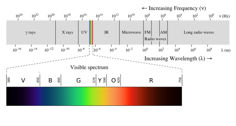
If we focus only on the visible spectrum from the above image, we can see that there are some small numbers above it, ranging from 380 to 750. That loosely represents the range of wavelengths that are visible to “standard”, average observers. If we were to divide up that scale into single nanometers, or even partial nanometers, we could consider the “colour” of each of those slices as the “colour” that we’d see when looking at a very narrow sharp band of a laser of a particular wavelength²; it’s the most “saturated” “colour” we could see of that particular flavour. While we could vary the radiant energy of the laser in question, there would be nothing more “saturated” than the purest of laser lights represented within that thin wavelength.
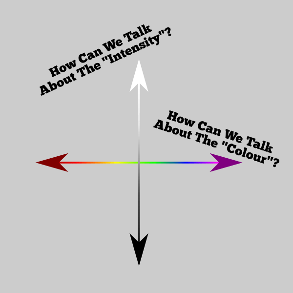
So how can we talk about “colour” if it is this crazy adaptive thing? How can we discuss digital RGB for creative folks in a manner that everyone can at least share values and numbers that mean things in an absolute sense? How can we even begin to discuss “saturation” if we don’t have a guiding map?
The answer comes from what is known as the CIE 1931 colour space. It is a culmination of research from the decades that preceded it, from a number of very experienced minds. Rest assured, whenever you see any colour encoding model such as CIE Lab, RGB, YCbCr, or any of the other nonsensical mumbo jumbo terms out there, they all derive from that magical CIE 1931 entry point.
So let’s answer our question in a way that is suitable, without getting too knee deep into sludge…
Answer #11: The qualia of a given mixture of visible light is quantifiable in an absolute sense using the model that maps visible light spectra to chromaticities, which starts with the CIE 1931 colour space model.
The key takeaway here is that the CIE 1931 colour space model glues the visible spectrum of laser-like wavelengths to a human oriented concept known as chromaticity in a single, convenient model. Further, it lays a critically important metric of numbers down, allowing us to discuss chromaticities using absolute values.
We first hit the term chromaticity back in Question #3, but we tip-toed around defining what it actually is. Up to that point, we’ve been rather careful to say the word “colour”, and yet not been able to discuss whatever it means in an absolute sense. That is, “colour” is a slippery term that dives deeply into contextual elements, while chromaticity on the other hand, is very clear and very absolute, relative to a specific model.
And that brings this installment to a close! We haven’t really investigated just what chromaticity coordinates are, how the CIE 1931 model works, nor any of that stuff. What we have done though is flesh out the term chromaticity such that we are now able to discuss uh… that… uh… thing sort of kind of loosely described as “colour” in a way that is unambiguous. So while we have many relative colour encoding models such as RGB, with their endless supply of transfer functions and what not, we now have an absolute model to discuss the actual visible light qualia side of things. This will serve us extremely well in the lines of investigation to follow…
¹ Don’t let the WANKers get you down here. Lab, YCbCr, RGB, Luv, Jab, and all those other crazy terms all derive from this magical bit of work in 1931. All of the other colour encoding models and various tidbits are nothing more than structures built on top of the CIE 1931 colour space. It’s single handedly the most important model to learn and understand for a digital image maker.
² The crappy image is of course not actually the visible spectrum, but rather an sRGB downgraded artistic representation projected out of your display. You’ll also notice that the thing goes from some darkness to some colours and then back to some darkness. This is in fact a complex thing to explain at this point, but worth noting: chromaticities are not equally “light” relative to each other. Heavily saturated blues can be very “dark” compared to heavily saturated greens at equal radiant energy! Damn that psychophysical rubbish…
