We have laid some tremendously important groundwork in the most recent questions. Within that, even if you have seen or heard about the concepts introduced prior, it is helluva important to make sure that what we have explored is extremely clear. Sadly, the chromaticity diagram explored in Question #13 needs a bit of a revisit to help us out as we start talking about getting our work from one context to another.
So let’s have a bit of a deeper drill down into the chromaticity diagram…
Let’s get that ever-most-important diagram back fresh in your mind…
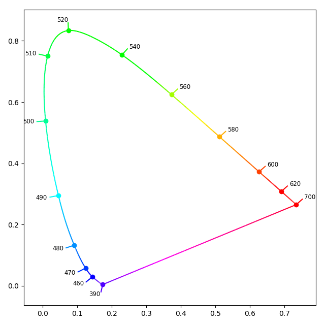
I can already hear you screaming out “WTF?” “Where did the colours go?” “Where’s the triangle?” I’ve plotted the diagram in FIGURE WTF 1931 using the colour wonk’s best toolkit “Colour” without any confusing details.
- The inside colour mixture gradient, as we learned in Question #13 can be quite confusing to newer folks. Your display can’t display all of the visible light wavelengths, so they have been removed.
- The outer shape is what we want to focus on, which in the above image is an sRGB representation that attempts to give you a visual idea as to the colours of the respective wavelengths of visible light. Remember, given point 1. above, those colours are simply a vague approximation as your display isn’t projecting lasers out at you!
- The inner triangle is gone. Even though this may be a familiar feature to this diagram, we aren’t quite ready to tackle what it means just yet. Darn close, just not quite…
Great. You already know all of this though, so why are we going over it again? Review is always great, but in this case, we need to really understand that the diagram is actually another “linear” plot. That is, the plot is radiometrically uniform with respect to an observer; the distances are all anchored in a physical energy relationship.
But as you will recall from Question #7, mixing humans with linear physics models is a great way to lose your marbles. In Question #7, we hinted that standard observers do not experience a linear relationship with the radiometric intensities of light. Five times the radiometric intensity of a light will not appear five times as perceptually intense to a standard observer. And guess what… standard observers also do not experience a nicely uniform relationship of sensations of “hue” or “saturation” with radiometric changes.
Somewhere around 1942, a number of people set out to model the nonlinearities between the physical wavelengths of visible light and the perceptual sensations observed in a standard observer. David MacAdam and others provided this critical bit of research, which ended up becoming known as MacAdam Ellipses…
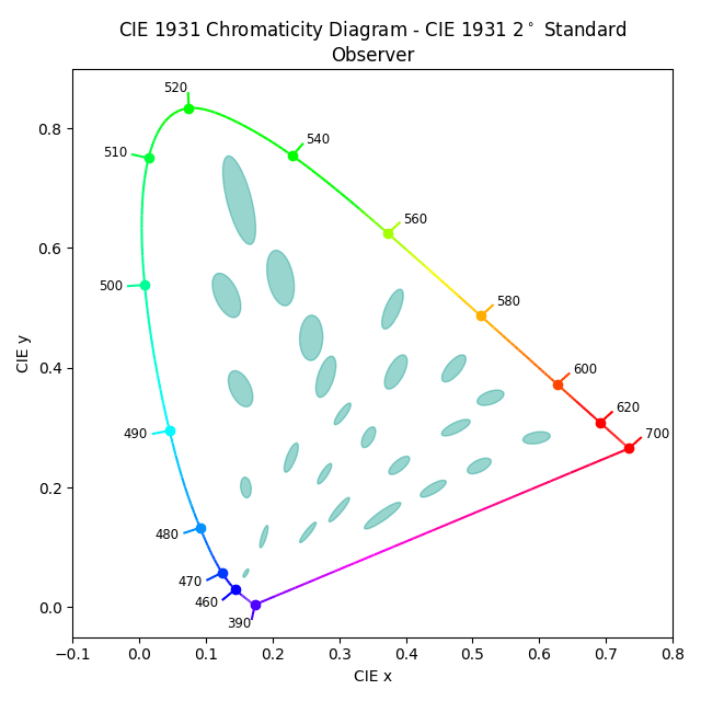
You can see some teal coloured ellipses in FIGURE WTF ELLIPSES. The research showed that visible light spectra mixtures in those ellipses all appeared virtually identical within those mixture ranges. That is, the observers tested weren’t able to discern a noticeable difference between the radiometrically mixed quantities of visible light spectra; everything in the ellipses was for all intents and purposes the same “colour”.
At this point we realize that the ever important chromaticity diagram is entirely confusing in terms of its dimensions. It’s not a very good map to evaluate how different a particular mixture of visible light spectra is. How could we measure that? Of course, this is related to our question…
Question #15: What does perceptually uniform mean?
Imagine looking at map on your phone. You’ve walked about 1 cm on your phone’s map, and walked for about five minutes. But suddenly, the next 1 cm on your phone map took you thirty minutes, because it was straight up the side of a huge steeply inclined mountain. We could say that the map, relative to surface area, is nonlinear with regard to the overhead map. The 2D map is a misrepresentation of surface distance!
This is a similar handy analogy to remember when examining the CIE 1931 chromaticity diagram; it is not perceptually uniform. That is, the measurements we make with the chromaticity coordinates are not a useful metric for evaluating differences of a perceptual nature. This is very similar to our above walking example, where there is a disconnect between the top down map on our phone and the surface distance that needs to be covered by foot.
Let’s cut to the chase and take a look at what one particular perceptually uniform-kinda-sorta-ish version of the CIE 1931 chromaticity diagram might look like…

Notice this is more or less the same spectral locus with the same ellipses in the earlier FIGURE WTF ELLIPSES. They aren’t quite as elliptical in FIGURE OH NO NOT ANOTHER PLOT, as the underlying CIE 1931 model is warped and bent in such a way to make the ellipses a little more uniformly shaped toward circular. Sorta. Kinda. Damn this perceptual rubbish…
FIGURE OH NO NOT ANOTHER PLOT is the CIE’s 1976 remixed twist on the original CIE 1931 diagram that attempts to represent a more perceptually uniform variation of the original CIE 1931 diagram. It is known as the CIE 1976 Uniform Chromaticity Scale, and scale is very important here; the image is non-uniformly, or nonlinearly, scaled in an attempt to be more perceptually uniform.
Here, a measurement of a distance between two chromaticities on the CIE 1976 UCS is sort of, kind of, vaguely akin to perceptual difference for a standard observer. Because the underlying model is warped and bent, the x and y axes are transformed to new labels representing u’ and v‘¹. Project the wavelength mixtures of light and you get an idea as to how different they will be in relation to another mixture.
In an ideal world, there would be some magical transformation of the CIE 1931 data that would make all of the MacAdam ellipses equally shaped circles, to make equivalent measurements uniformly different in the perceptual sense, but no such transform has yet been created.
Answer #15: The term “perceptually uniform” refers to a means of comparing values with corresponding perceptual differences.
I don’t know about you, but that’s about enough colour science mumbo jumbo for me for now. It is important to cover the term because you will now be able to discern between the plethora of different colour models out there, and have a greater insight as to why they are designed in different ways. You’ve also managed to stick another useful screwdriver into your artistic tool belt, and have hopefully started to appreciate that different colour encoding models can achieve different things.
Let’s see if we can build up our knowledge further to get to the nitty gritty details of practical artistic, creative, or batsh*t-crazy-nutbar-remarkable digital work. We are almost there dear pixel pusher. On to the next question…
¹ You may have noticed that the u’ and v’ have little “prime” symbols to the right of each of them. In colour science things, the prime symbol typically denotes nonlinear with respect to the conventional linear plots and assumptions. Sometimes this nonlinearity is specified using a “star”, which in normal keyboard terms is an asterisk *.
