Remember how I promised years ago that this series would supply the typical digital image maker with fundamental concepts to get a grasp on the complex world of digital colour? This post is the second half of bolting down two important distinctions that cascade into many other insights.
Question #26 probably feels like a massive departure from the four questions prior that culminated in Question #25’s discussion of what is alpha. In many ways, each question attempts to add a piece of understanding that can be re-assembled into useful weaponry, and this post is precisely such a piece. In fact, it’s the other half to Question #26’s question about stimulus encoding values1.
First, let’s barf out that question…
Question #27: What is a perceptual sensation when discussing digital colour?
It’s a broad stroke question, but we are going to first differentiate ourselves from this question’s twin sibling of Question #26’s tristimulus encoding model. As with all things colour, it can be extremely helpful to see an example of what the hell something might be…
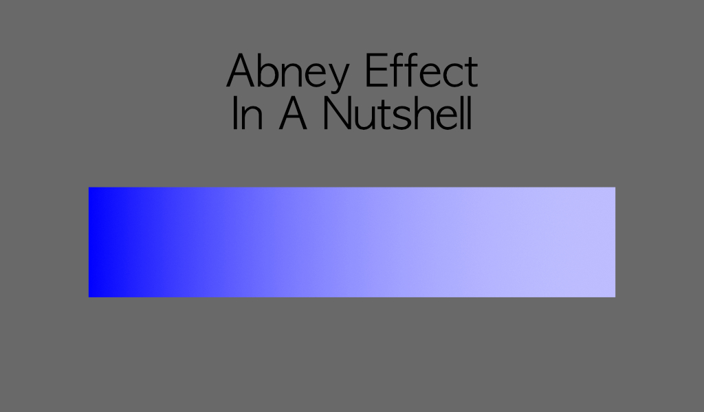
See how the perceptual sensation of blue seems to drift to a purple mauve? Have a peek at that for a while, and come back after the break to break down what is commonly referred to as the Abney Effect…
So what are we f*cking looking at in FIGURE F BLUE? Here we see a basic gradient, which consists of a “pure” primary light, without any complimentary light. That is, it’s BT.709 / sRGB blue, at full intensity. Gradually, we add some “achromatic” digital R=G=B light in terms of the respective tristimulus encoding. Except as we do this… the perceptual appearance of hue twists into a… purple-ish!
Let’s analyze this using some of the quantitative means to discuss colour we covered in Question #13 and Question #15. First, let’s generate a simple “sweep” of the above values.

Now let’s plot the above sweep, as a line in a “Perceptually Uniform Colourspace” such as the model from Question #15, CIE 1976. Here each of the swatches march from “more pure” to “less pure”, and form a line from the absolute purest spectral locus position, through our starting sRGB blue value, to the achromatic adapted D65 white point.

Notice how in this “Perceptually Uniform” plot, we have a straight line. One might be wondering that if the damn plot is actually “Perceptually Uniform” and whether or not a “uniform” straight line should be… “Perceptually Uniform”. Fair question. Before covering that… let’s generate a sweep of an attempt at a perceptually uniform “hue” version.

The FIGURE PLUS OR MINUS is a sort of guesswork based on a model2 that attempts to be a little more “Perceptually Uniform” with respect to “hue”. Let’s have a peek at how that plot looks. Again, we draw a line connecting each of the swatches from left to right above, as they march toward the achromatic white point.
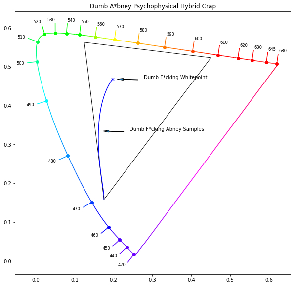
Oh gosh. The damn line is curved in a “Perceptually Uniform” plot. From just beneath us, we can hear the blood curdling screams of “WHAT THE F*CK IS GOING ON!?!”
As the above question hinted, if the model is supposed to be perceptually uniform, then a uniform straight line should be representative of a uniform step distance in perceptual appearance. And of course we can clearly see that CIE 1976 sure as hell does not seem to abide by this rule, and therefore we’d have to place a caveat on the idea that the CIE 1976 model, or any model for that matter, lines up with a perceptual appearance metric.
A general rule of thumb, try to remember that models are models; Human crafted things that try to represent something for serving some distinct purpose. The map is not the territory however, and we must be very careful in how we read models! Caveat Emptor. In this specific case, the CIE 1976 plot is a distorted plot of CIE 1931 tristimulus values, massaged in such a way that “distance” holds a little more validity with respect to how we’d sense them on the perceptual side. And we can clearly see that it’s not without some deeper issues…
So where does this leave us? The reason we went romping across Abney is to show that there’s a fundamental disconnect between the tristimulus encoding side, the side that sort of, kind of, almost aligns uniformly with electromagnetic radiation, and the perceptual sensation and appearance side. Remember Dr. Jekyll and Mr. Hyde? It’s almost like colour is composed of a Dr. Jekyll and Mr. Hyde; two different perspectives on the “same” thing!
Let’s see what the CIE has to say for defining “colour”. Perhaps in an entirely unsurprising turn of events, there are two definitions listed.
colour, <psychophysical>
CIE Termlist for colour
specification of a colour stimulus in terms of operationally defined values, such as three tristimulus values
But wait… there’s more!
colour, <perceptual>
CIE Termlist for the other colour
characteristic of visual perception that can be described by attributes of hue, brightness (or lightness) and colourfulness (or saturation or chroma)
Let’s try to get to an answer that can work for us…
Answer #27: Perceptual sensation of colour is a cumulative appearance based on a number of contextual3 facets.
After seeing our demonstration above, we can probably hear the screams from the depths of the abyss of the poor shadows of former even more poorly informed graphic designers who painstakingly and meticulously copied the f*cking hex codes into their work, only to have the client lose their minds that the “Colour looks different!”. So many layers of really bad and broken ideas stack together into one gargantuan sh*t sandwich.
Imagine being the unfortunate 3D rendering wonk who models a car with glossy BT.709 blue paint, and renders it under a nice soft achromatic cloud cover. The blue paint appears as a graduation from the blue to white cloud reflectively mixed from the glossy coating, just like the above demos… and the client? They sh*t their pants screaming at the poor 3D rendering wonk that their brand identity blue car paint is f*cking blue, not mauve! The 3D rendering wonk goes and yells at the poor 3D rendering lighter and, they go and yell at the… you get the idea.
So what is in this for the digital RGB surgeon or… digital RGB serial killer? It is with hope dear reader, that by equipping oneself with a dual Dr. Jekyll / Mr. Hyde notion of colour, one is more informed to try and break down problems and hopefully solve them.
We can, building on top of the conceptual framework outlined between this Question #27 and the previous Question #26, loosely describe a sort of cylindrical model for both of the CIE term definitions of “colour” above. A cylindrical model has a height, an angle about some origin, and a distance from the origin. If we assume that our adapted white point is our origin, we have two parallel models we can weaponize. While familiar ideas, it can be helpful to bolt them down into a more concrete form:
CIE Tristimulus Cylinder Model:
- CIE xyY Height == Luminance / Y
- CIE xyY Angle == Chromaticity angle
- CIE xyY Distance == Chromaticity purity
And as a corollary we now have a Perceptual Cylinder Model4 version of the above!
- Perceptual Sensation Height == Brightness
- Perceptual Sensation Angle == Hue
- Perceptual Sensation Distance == Chroma
And we can see a relation breakdown of each parallel model…
- Tristimulus xyY Luminance is associated with but has a nonuniform relationship to Perceptual Brightness.
- Tristimulus xyY Angle is associated with but has a nonuniform relationship to Perceptual Hue.
- Tristimulus xyY Purity is associated with but has a nonuniform relationship to Perceptual Chroma.
And from that loose sort of a breakdown, we can sort of see some interesting connections between the two models! It is a good rule of thumb to remember that in terms of the two parallel models, while each facet is associated with the other, much like Dr. Jekyll and Mr. Hyde, each pair of facets hold a non-uniform relationship to the other!
As we explored above, the CIE xyY angle and distance in a straight line hold a nonuniform relationship to the Perceptually Uniform Sensation of hue! Conversely, a Perceptually Uniform Sensation of hue is going to hold a nonuniform relationship to the CIE xyY angle between the achromatic point and the spectrally purest point.
As per Peter Engeldrum, a general rule of thumb to identify when one is in the perceptual appearance domain is to look to the words used to describe whatever is being described. If a term ends in “ness”5, there’s a good chance we are talking about Mr. Hyde’s perceptual appearance sensation! “Colourfulness”, “Brightness”, etc. are all good examples.
To connect the dots further, we should be also able to look back to the idea of a compressing transfer function, as with Question #6, and know that because it is a compression function based on the perceptual sensation of brightness, that the relationship will be nonuniform with respect to the CIE xyY luminance component, and indeed it is! The same goes for ideas of chromaticity purity versus a perceptual sensation of chroma, too!
Every poor graphic designer is probably out there revisiting their thoughts on brand identity guidelines right now…
So let’s wrap this up, and remember to keep this duality of “colour” at the front of our minds for what is going to follow…
- As with most things colour related, it’s worth pointing out a bit of pedantry. The goal of this series has always been to provide useful groundwork and concepts to digital image surgeons, or digital image serial killers, to help them perform surgery in the first case or… uh… work their craft in the second. Some of that comes with a totally-unscientific-guesswork trade off of strict adherence to CIE terminology versus “useful” and selective corner-cutting. The previous post gets so close down to the metal of discussing colour, that we are in the domain of terms that colour people will bicker and argue about for a very long time. It is with hope that a PhD colour scientist foolishly reading these posts would see that sometimes, in the interest of nudging a specific audience’s progression towards a greater understanding, that a corner or two is cut. The author begs forgiveness from those colour science PhD types… ↩︎
- The model used here was Dr. Fairchild and Dr. Ebner’s IPT, for those nerds out there interested. It’s a mathematically fit model to some datasets, which also generally means everything falls to crap pretty quickly. ↩︎
- Does the colour of the paint surrounding what we are looking at impact our sensation of colour? Yes. Does the brightness of the light lighting the paint impact our sensation of colour? Yes. Does the white thingy as per Question #14 we’ve adapted to impact us? Yes. Don’t despair! The point isn’t to throw our hands up in the air and give up. The point is to be aware that no amount of code value computer gobbly math nerd slop can insulate us from the nuances of perceptual colour consumption. The more aware we are about the potential compounding contexts that influence the perceptual sensation of a particular stimulus, the more well equipped we are to deal with those differences out in the dirty trenches of image making. ↩︎
- Don’t get the idea that this simple division is an endpoint! Colour science and vision researchers have some agreement on the idea that there are “layers” or “orders” to this complex stack. For the purposes of this post, we could say that the twin Dr. Jekyll and Mr. Hyde models are of a lower level order. Closer to the metal, with all sorts of complex things potentially happening in the layers above. All we are trying to do here is derive two basic concepts as a tool for ways to consider colour. ↩︎
- Engeldrum PG. A Theory of Image Quality: The Image Quality Circle. jist. 2004;48(5):447-457. doi:10.2352/J.ImagingSci.Technol.2004.48.5.art00012 ↩︎
