Brighter? Lighter? More light? Less light? Where the hell does physics and energy fit into all of this? Arrgh.
If we don’t have a clear grasp on what linear means and it’s relationship to digital colour, we are going to have a hard time discussing deeper subjects. So what the hell is happening when we slide those RGB sliders like we asked back at Question #1? We can sort of understand that the code value representation is bound to some notion of a ground truth of “linear light energy”, but just what the hell is that?
Given you are all likely digital pixel pushers and image smiths, let’s make this simple and start with an image. It’s a quiz of sorts, and a not-super-challenging one at that…
And now, the question…
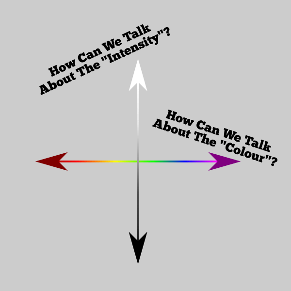
Question #12: How can we describe light intensity?
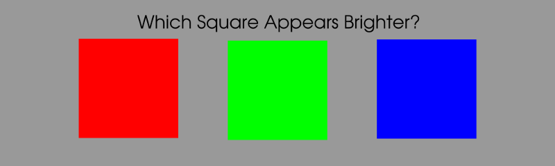
Order those three swatches above in the order you would consider lightest to least light, then we will see you after the break…
As a pixel pusher you’ve probably noticed more than a few things about the nature of certain colours and their respective lightness relative to each other. While you may not have made the connection between a given colourspace’s code value and it’s relationship to linear light output from your display, you certainly may have noticed that, when you set the RGB sliders to an equal value, the damn colours don’t maintain an “equivalent” lightness!
The simple answer to the above visual quiz is of course that the three colours are unequal looking in lightness, with the green square appearing the lightest, the red square second, and the blue square being the least light. That is, each swatch is set to an identical RGB code value emission level, yet the three squares are not the same perceptual intensity.
As we learned quite a ways back, colour is a psychophysical phenomenon; one part is psychological and the other part is physical.
“Color is not actually a property of light or of objects that reflect light, it is a sensation that arises within the brain.”
— Biologist Timothy H. Goldsmith, What Birds See
If the sRGB code values are equal, and we see a difference in lightness, which part of the problem here is wrong? To understand the answer, we need to divide the discussion into two axes that we can use to communicate “intensity” of the light.
When we look at the three swatches above, and assuming our vision is in accordance with what has become known as the Standard Observer model, our perceptual system sees the green swatch as the “lightest” of the three. When we use a perceptual description, we could say that the green swatch is more luminous; it appears to have more perceptual energy than the red or blue swatches.
Yet at the same time, we know that the sRGB values are set to maximum intensity via their code values. How can we reconcile the swatches appearing at varying lightness if the code values are equal? The answer is quite simple; various colours of light hold differing levels of luminance at equal physical energy. We call the physical energy value of light radiance, or radiant energy.
That’s right… there’s two “energies” at play here. One, radiant flux or radiant power, is relative to our constructed physical radiant energy models. The other, luminous flux, is relative to our psychophysical perceptual models. An easy way to remember which is which is to remember that radiant is tied to radiation, and we know that radiation is related to physics and energy.
Let’s refine our rough hewn knowledge by adding a bit of sanding via a couple of useful terms.
Answer #12: There are two useful axes to discuss the intensity of light; radiant energy is a ratio of physical energy required to generate an emission, and luminance is a photometric measure of how much perceptual energy the light holds relative to our psychophysical systems.
That means that we could have a very saturated blue laser at equal input radiant energy to a green laser, and the green laser will appear vastly more luminous than the blue. There’s a whole model that describes the relationship between luminance and radiant energy of the various visible light spectra, but we won’t bore you with those details just yet, even though we have sort of let the cat out of the bag in the previous post.
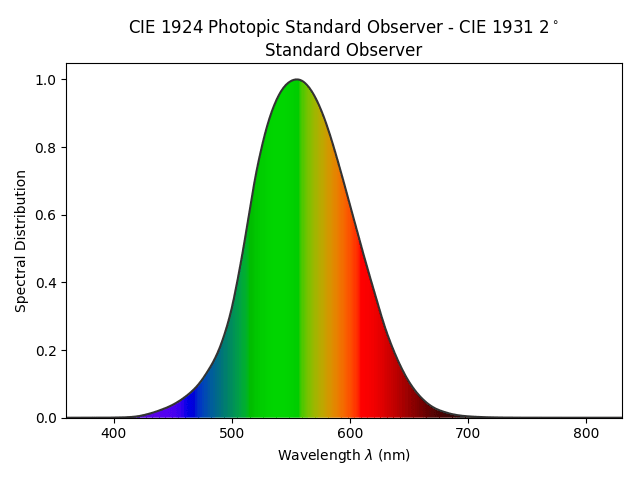
As a pixel pusher, you are likely more interested to learn if we’ve uncovered anything useful here when thinking about our digital colour work. The relationship between the visible light wavelengths and how much perceptually luminous the energy will appear is described in the following luminous efficacy diagram.
So if you are wondering if we can apply this knowledge to pixel pushing, the answer is of course yes! For all intents and purposes, we can consider the linear RGB values after we remove the nonlinear encoding for a particular transfer function, to be the radiant energy ratios. We need to use colour science math¹ to derive the luminous perceptual energy ratios, which is a fancy way of describing a greyscale image. So how do we convert a colour to a greyscale representation of the coloured light value? Great question…
In order to convert a coloured RGB pixel into a greyscale pixel, we know that we need to set each of the red, green, and blue channels to some identical value, otherwise the pixel will have a colour cast. When we set the pixel to have equal code values, the output colour of the light will appear achromatic if we are fully adapted to the “white colour” of the display. But how do we figure out just what to set the RGB values to when we are converting from a coloured pixel to an equivalent greyscale pixel?

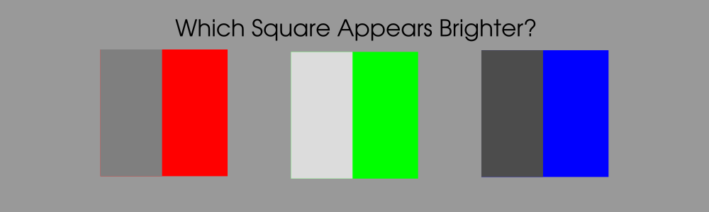
In the above image, we have three RGB swatches, each at 100% emission of the (assumed) sRGB display’s red, green, and blue lights. How do we convert those swatches to greyscale? We know that from a radiant energy perspective, each value in our triplet is outputting roughly the same display emission energy, just out of the individual lights. Great, so why not just set each of the RGB code values to 100% then, if the individual channels are set to 100%?
Wait a minute… they don’t appear to be the same perceptual energy when they are in colour, so setting the red, green, and blue swatches each to 100% RGB emission will make them appear identical to each other! That’s not going to work, is it? The green doesn’t look like 100% RGB emission, and the red and blue certainly don’t!

The solution to the problem, as you may have inferred, is that we need to “weight” each of the emission strengths based on their respective coloured light contributions to the luminous perceptual energy. We can’t use equal ratios of the RGB radiant energy values.
We aren’t going to get lost in math here, so let’s just accept that for REC.709 / sRGB based RGB lights, the luminance ratios are roughly 21.26% red, 71.52% green, and 7.22% blue, which we then sum together². The green light in an sRGB / REC.709 display contributes 71.52%, the red 21.26%, and the blue 7.22% to the overall greyscale result. If we do that, the resulting achromatic pixel will appear to have the same luminous perceptual energy as the swatch had when it was in colour³! The result is below.
And with that, we’ve closed another chapter. Hopefully it didn’t hurt your head too much, and you’ve managed to add a little more clarity to discussions of light “intensity”. A handy question to ask is whether the value is trying to describe physical radiant energy or perceptual luminous energy? On to the next question…
¹ Whoo daddy there is no shortage of people “helping” other people out there on those question and answer sites who screw this up royally. Let’s be painfully clear; the luminance coefficients are derived from the chromaticity of the light mixture. That means that for any given colourspace, with a set of three fixed primary lights, there is precisely one correct method to derive the luminance coefficients. Those online sites throw numbers around that are frequently historical artifacts that are completely and utterly wrong given the context in this decade and into the next. The TL;DR is that you should be extremely weary of deriving luminance coefficients from online sites if you are building software. The other TL;DR is that there are plenty of folks utterly confused about digital colour out there apparently. Be warned. Trust no one. Including this idiot⁴. This is a very deep rabbit hole, however. For further reading on the subject of “colourful” as “brightness”, consider Ralph Evans “The Perception of Color” 1974, or skimming over the Helmholtz–Kohlrausch effect entry over at Wikipedia.
² The astute reader will likely have a question or two about whether you should calculate the result based off of the display linear or the display nonlinear code values, and she’d be right for thinking there will be a difference. This is also why there are two terms typically for the linear versus nonlinear calculations, luminance and luma, where luminance typically refers to calculations derived from the linear light energy code values, and luma referring to the greyscale calculation based off of the nonlinearly encoded code values. I’ll leave you to ponder that question on your own, and perhaps try to deduce which version is more “correct”.
³ It should be duly noted that, as always, colour is a complex psychophysical sensation. As such, there are a myriad of psychophysical effects that cannot be accounted for with a pure luminance based evaluation of spectra. In particular, the Helmholtz–Kohlrausch phenomenon cited above plays a large role in determining overall sensations of luminance, for example.
⁴ Always fact check. The keen colour science folks will note that the post uses “lightness” here, where many folks might flip flop between lightness and brightness, using the two terms interchangeably. In terms of Colour Appearance Model language, the two terms are specific and unique. As always, there’s a risk of losing the audience, and “lightness” was chosen as the means of communication. Also note that footnote 4 is a meta footnote of a footnote. It’s an Inception footnote.

4 replies on “Question #12: How the F*ck Can We Talk About Light “Intensity”?”
Hi Troy
Forgive me for asking this question while I was reading this particular post. Just had a noob query about adding the following paragrah.
“The green light in an sRGB / REC.709 display contributes 71.52%, the red 21.26%, and the blue 7.22% to the overall greyscale result. If we do that, the resulting achromatic pixel will appear to have the same luminous perceptual energy as the swatch had when it was in color”
So for that picture that is below this paragraph, I can see the red, green, and blue pixels with their corresponding achromatic pixel that represents the same amount of luminance as their colored counterparts that are represented on the right side. I got doubtful regarding that part when you said that we need to add the contributions of individual lights to reach the overall greyscale result. Does that mean that for that red pixel in the pic, we add 7.22% of blue and 71.52% of green(as per sRGB specs) so that we get a chromatic pixel that represents the same luminous energy when the red pixel was in color? And also that we do the same for the green pixel and the blue pixel? Or am I completely wrong? I am coming from a VFX editorial standpoint and so most times, we check for color problems by comparing the processed client dailies files with client-supplied references and when there is a mismatch, we just pass it along to the color dept that figure out what went wrong and why. Further to this, we are mostly in the dark as far as color discrepancies are concerned as well unless we dig deep ourselves into understanding these topics, and like you said, more often than not, the rabbit hole that we go down will end up creating more confusion than giving us clarity. Your article has been a boon in understanding why a pixel is appeared the way it is, on a particular screen.
If there is a reliable and simple source of info that you can point to that explain this conversion from color to greyscale, it would be a great help:)
AV
LikeLike
Technically your understanding is correct; it is a weighted sum of the respective luminance weights for each primary in a given additive RGB colourspace. So in the BT.709 / sRGB case, the percentages are more or less as described above, which means multiply each channel by the weight, and sum.
Sadly, because luminance was designed under a specific additive constraint, the full story isn’t entirely communicated with luminance. For more information, it is worth searching Helmholtz Kohlrausch effect, MacAdam Moment, or Swenholt Evans.
Yet more rabbit holes.
LikeLike
Hi Troy,
Thank you so much for this adventure through the rabbit holes!
I understand that the values 71.52% for green, the red 21.26%, and the blue 7.22% (they work in linear) and whenever they are converted to sRGB display they get the (0.86, 0.86, 0.86) values for the grey equivalent to green (perceptual luminous) (1.0, 0, 0), (0.5, 0.5, 0.5) for the red equivalent, and (0.3, 0.3, 0.3) for the blue. At least these are the values that I pick up from your image. Is that right?
Thank you!
LikeLike
Thanks for the kind words, Kay.
I believe the answer is “Yes”; the math should be applied on the _meaning_ of the encoding, not the encoded / compressed values. So in this case for example, when we take the weighted sum of the tristimulus values for the pure red swatch at 100% emission, and multiply it by the red luminous weight, we end up with ~21.26%, or 0.2126. Finally, we must encode that value for whatever display we seek to have the tristimulus value projected out of, which in this case is typically an sRGB display with an EOTF of a pure 2.2 exponent.
`0.2126^(1.0/2.2)` will yield the code value in question more or less, plus or minus some nuanced management details.
LikeLike