Another big word for someone who likely only wants to focus on painting on their iPad Pro. The bad news is that exploring new terms takes time and energy. The good news is that there is likely no more an important term for a pixel pusher to learn. Why haven’t you heard of it before? That’s a great question, but if you’ve followed along this series, it probably doesn’t surprise you.
Looping over things we’ve explored, we have learned that code values frequently are encoded and sometimes even manipulated nonlinearly, according to some transfer function. We also have learned that the primary basis RGB lights never change their “colour”, and merely increase or decrease in intensity. In order to get into exploring how different displays and colour spaces impact your digital work, we will need to tighten down our understanding on this last sentence. That is, to discuss “colour”, we need to investigate perhaps the most important colour science term called chromaticity a bit more…
Question #13: What is a chromaticity?
Given you are all folks interested in images, let’s plop one of those here. You will likely have seen this strange looking thing before…

So now that we’ve gotten the obligatory “This idiot must show you this stupid drawing so that you trust what they are typing on about” out of the way, let’s actually try to understand what the diagram is and, more importantly, what it means to you, as a pixel pusher.
I’d like to apologize. I can already feel you tuning out. Some person you thought who understood this sh*t tried to explain that cursed image in some blog post, or some forum, or some random website on the infosupahighway. You are here likely because the “explanation” wasn’t… uh… an explanation that made much sense to you.
I completely understand. You’ve come this far though, so hopefully you have built up enough faith and can feel that all of this is building up your digital colour understanding. So chin up, and take the punch…
FIGURE WTF A is what is known as the CIE 1931 Chromaticity Diagram. It is helluva important in your overall understanding of digital colour. Remember how in Question #11 we said that everything colour related starts with that CIE 1931 thing? It’s true!
The first note worth pointing out is that the whole shape in FIGURE WTF A is a byproduct of that critical CIE 1931 work, and everything RGB, as well as anything you’ve ever done regarding printing in CMYK or anything else, relates directly back to it!
But just what the hell does it represent?
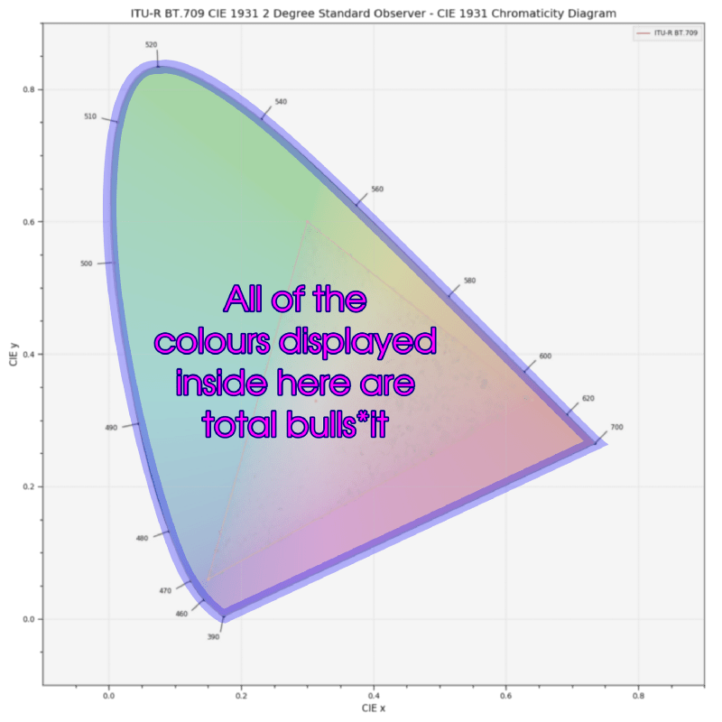
Observe that in FIGURE WTF A there is a strange oblong shape with a flat bottom. A critical introductory revelation is that the cake is a lie; the literal colours displayed within it are pure garbage. They are sort of like looking at a city map and understanding that millions of tiny little people don’t live inside of the markings, and that the names and positions aren’t actually the places. The colours are just sort of a creative rendering. The bulls*it colour zone is graphically outlined in blue in FIGURE LESS WTF B below.

But what about the shape itself? Why is it wonky?
If you trace your mouse or finger along the outside of the curved portion of the shape, where does this particular shape come from? The answer is, again, that damn CIE 1931 magic stuff. But what does that shape represent? That shape is known as the spectral or spectrum locus. That is, that infinitely thin line represents all of the colours of the visible spectrum, peeled apart into their components. The little numbers around the outside represent the wavelengths of visible light in nanometers, aka a really, really, really small part of a meter that describes the chromaticity, or more loosely “colour”² of the light.

Think of that thin black line overlaid in purple above in FIGURE LESS WTF C as an infinite number of little tiny lasers of completely different colours. That vibrant green laser you bought for nine dollars from Amazon? Chances are it has a very unique monochromatic wavelength specified on the side on a crappy sticker somewhere around the 500nm range. The red laser? It too will have a specific wavelength, but reds are somewhere above the 600nm range. Blue lasers? Maybe somewhere below the 470nm range. The thing about visible light spectra is that they represent the most heavily saturated isolated light hue a standard observer³ can see. You can’t go north of north with wavelengths of light, and there is simply no more saturated a chromaticity than viewing a single slice of a wavelength of light.
Notice the straight edge that isn’t highlighted? It isn’t highlighted because no single purely spectral wavelength corresponds to that line. That means that no, you can’t buy a pure magenta laser of some single wavelength from Amazon, sorry. That straight, infinitely thin edge can only be achieved by mixing pure spectra, as no single spectra represents those perceived colours.
The final “gee whiz moment” may be to appreciate that if we have an infinite number of little lights, just like way back at Question #1, you should now realize that the bulls*it colours represented inside represent all of the possible mixtures of the visible light wavelengths, plotted out using some alien, human massaged, number system. Mix any combination of lasers, and you end up somewhere inside that ever important diagram! Project a pure laser out of… well… a laser, and you are projecting out a light that has a chromaticity somewhere around that purple outlined region in FIGURE LESS WTF C!
If we are making a map, we need some sort of unit that we can plop along the bottom or top of the map. Some maps use imperial measurements, while more sane maps might use a metric measurement. Some maps include north, south, east, and west. This map? It uses north, south, east, and west too, only it doesn’t call the coordinates that. The east to west metric is x on the chromaticity diagram, with y being north and south. This particular map is the CIE 1931 chromaticity diagram, with lowercase x and y being the cardinal directions.
Critical point worth noting here is that if someone gives you two chromaticity coordinates using x and y, there is absolutely no ambiguity as to what chromaticity they are speaking of; those values are absolute and every single “colour” the “standard observer” “sees”, can be identified on the CIE xy map. If that x and y coordinate is coupled with a Y, you have a precise definition of a single chromaticity, at a given luminance⁴. Recognize that last term? You had better not already forgotten the last article…
Now we have the map, we understand what it means, and we have some useful numbers via x and y⁵ that are bound to visible wavelengths of light.
Answer #13: A chromaticity is expressed on what is likely the most important coordinate system you will learn as a digital artist. A chromaticity is a coordinate that defines a mixture of visible light within an absolute encoding model. It is the crucial mapping of visible light spectra to how a standard observer’s perceptual system is stimulated.
Literally every shred of colour stuff you are exposed to relates to chromaticities and that CIE coordinate system that we scratched the surface on in Question #11, and fleshed out a bit more here. Don’t believe me though, dig around a little bit in whatever area of colour you are looking at and you can be assured you’ll find it. Hopefully now it actually makes a little bit more sense to you. And with that statement, a warning6…
In short, the uses of such illustrations probably should be confined to making lovely wall decorations in places that never will be visited by budding color scientists and engineers.
Digital Color Management: Encoding Solutions
You’ve probably seen some other “lovely wall decorations” too, and you might even know they are somehow related to this one. But that triangle?! What about the triangle?! What about terms like perceptually uniform or some such!? Those things are damn close to understanding now, but they will have to wait for another question or two…
¹ All of the imagery here has been flagrantly poached from the more than beyond awesome colour science library called Colour. It’s an incredible library for Python created by incredible minds. Shout out to the creator Thomas Mansencal and the most elite code value guru Nick Shaw. I can’t stress how invaluable the library is, and how excellent the people who frequent the channel are. They are wise wizards of the highest colour science order.
² SPOILER ALERT: You may have noticed that the words “colour” and “chromaticity” get tossed around here with a little bit of a sloppy approach. This has been on purpose, as the two words are tightly related. With that said, it’s prudent to perhaps break down the extremely complex idea of colour as representing the entire psychophysical phenomena of visible light experience, while chromaticity represents a very firm colour science model.
³ You may have noticed standard observer littered all over. Why? Because all of this crap is totally bunko if the thing to which it refers is not a standard observer as defined by the CIE 1931 and onward models. Folks can have different vision sensations due to biological and genetic things, and for them, these models aren’t accurate. There is some work that tries to map these sorts of sensations to the existing models, but it’s safe to say that when the observer is no longer a member of the standard observer sample set, that all bets are off!
⁴ There is a “height” that isn’t presented on this map. It is in fact Y, or luminance as you may recall from Question #12. That’s right, the CIE was wise enough to build a new “three imaginary light” model from their experiments, and somehow magically glued visible physical wavelengths into the psychophysical domain via Y. The CIE xyY chromaticity diagram is that monumentally important CIE XYZ model, scaled down to “fit” the zero to one range for X and Y, which is why they are lowercase, representing the same yet somehow different representation of XYZ!
⁵ Because x and y are simply scaled versions of their big brothers X and Y from the CIE 1931 work, and because the formula is dead simple involving all three imaginary lights X, Y, and Z, you can in fact derive the original XYZ triplet from a single xyY triplet. That means for all intents and purposes, if you communicate a chromaticity via xyY, you are also simultaneously communicating an absolute XYZ value. XYZ is the CIE’s magical-three-physically-impossibly-non-existent-colour-yet-works-in-math-model derived in that important 1931 release.
6 Edward J Giorgianni and Thomas E Madden citing E. J. Breneman in Digital Color Management: Encoding Solutions:
Odysseus had to go to great lengths to keep his sailors from being bewitched by the sirens. Similarly, people who want to specify color appearance with numbers must be wary of chromaticity diagrams with lovely colors on them. Such illustrations as this tend to imply (or the viewer tends to infer) that a particular perceived color is associated with a particular point on the diagram. This is false!
The chromaticity diagram is a stimulus specification. A given color perception can be elicited by a stimulus represented by just about any point on the chromaticity diagram, depending on the nature of the visual field and the viewer’s state of adaptation.
Although a colored rendition of a chromaticity diagram does, perhaps, help to indicate to a novice that with a common illuminant, blue paint will have a chromaticity in the lower left, etc., that novice is likely to jump to all the wrong conclusions and consequently find the world of color very confusing.
In short, the uses of such illustrations probably should be confined to making lovely wall decorations in places that never will be visited by budding color scientists and engineers.
Digital Color Management: Encoding Solutions

One reply on “Question #13: What the F*ck is a Chromaticity?”
Wow, I am amazed. Thanks!
LikeLike