
We’ve touched on the importance of the CIE’s chromaticity model, and its relationship to visible light spectra as the single most important framework for pixel pushers to get a firm grasp on to understand all of colour. Some folks may also likely have come to realize that the two dimensional representation is missing some important information.
That’s because that as wonderful as the CIE chromaticity two dimensional diagram is, it’s missing one crucial axis that should be made more apparent.
Question #18: What is the missing axis in the CIE chromaticity diagram?
So we’ve established that the chromaticity diagram is an absolute, two dimensional map of mixtures of visible light1. The terrific part of this is that we can express any mixture and get a resultant absolute coordinate that no one on the planet can muddle up. And it works pretty damn good, plus or minus some more complex details.
The downside? It’s not exactly useful for expressing how a mixture relates to overall radiometric or perceptual quantities of light. That is, for any given chromaticity coordinate, there are an infinite number of mixtures of intensities that can produce it.
Whoa that was quite a mouthful. Let’s backtrack a little bit…
We know that much like a conventional map, we have two dimensions that we can move in. For a conventional map we have one axis along north to south, and another axis along east to west. Even if we have an absolute map coordinate that tells us we are standing on Mount Everest, we don’t quite have enough information to tell us how high up we are, do we? In theory, with a big enough shovel, we could be standing at the exact same latitude and longitude, but at any altitude.
If we go back to our ever crucial CIE 1931 chromaticity diagram, we have our north and south axis via the y coordinate, and we have our east and west axis via our x. But what about that… “altitude”?
The xy chromaticity diagram is in fact a top down view of chromaticities, and if we were creative, we could use some tools to visualize how our view of the map is in fact hiding the “altitude”, to use our Mount Everest analogy above.
Let’s quickly return to the basic two dimensional CIE 1931 chromaticity diagram. We’ll start super simple, and slice up the visible spectrum up into 1nm increments. Think of it as 471 laser pointers of different wavelengths that you might buy from Amazon. That long straight line remember, cannot be expressed using any single visible light Amazon laser, and instead we need to mix the lowest and highest visible wavelength to achieve any of the chromaticities along that edge. If we needed a purple laser pointer along that edge, we’d need to mix two lasers, not one!

Enough of that boring bulls*it… you’ve been staring at those sorts of diagrams since Question #13, and all the plot represents is a model that allows us to connect visible wavelength mixtures of light to a model in an absolute way. In our above case, the horseshoe has a representation of the lasers using sRGB colours.
But what if we kick it up a notch, look back to Question #12, and talk briefly about intensities? We know from Question #12 that each visible light wavelength carries different perceptual energy levels at equal radiant energy levels. So what would that look like? Funny you should ask…
Et voila! All we have done is simply expressed our visible laser increments at constant radiometric energy. That shape should now connect directly back to illustrating why those blasted sRGB squares we covered in Question #12 appear brighter or less bright perceptually, despite being at equal emission intensities! That is, again, the perceptual intensity is quite different from the radiometric intensity.
You probably aren’t wondering what the lasers might look like if we plotted them relative to our peak fully-adapted set2? F*ck it, you get to see the 471 laser-like wavelength increments at 100%, 75%, 50%, 25%, and close to 0% anyways…
Now back to pixel pushing on your sRGB display…
Let’s take a small smattering of pixels in an sRGB image. For the sake of clarity, we’ll pretend our image is ridiculously uh… limited, and only features seven mixtures of sRGB light. That is, we can pretend our image has seven pixels of sRGB light mixtures in a row. We can of course visualize what that might look like on our CIE 1931 chromaticity diagram. You’ll be familiar with the damn triangle from Question #16, where we drew them out for an iPad Pro and an sRGB display.
The following plots the most saturated combinations of sRGB red, green and blue. That means that in the case of the “colour” mixtures, there are only one or two lights mixed.
The outer tips of the triangle, as we know, represent the pure primaries, with no complimentary light channel. The middle points are the mixtures of the two primaries at the tips. And of course our old friend maximum intensity R=G=B is in here too, aka sRGB primaries at 100% for each. Let’s have a look…
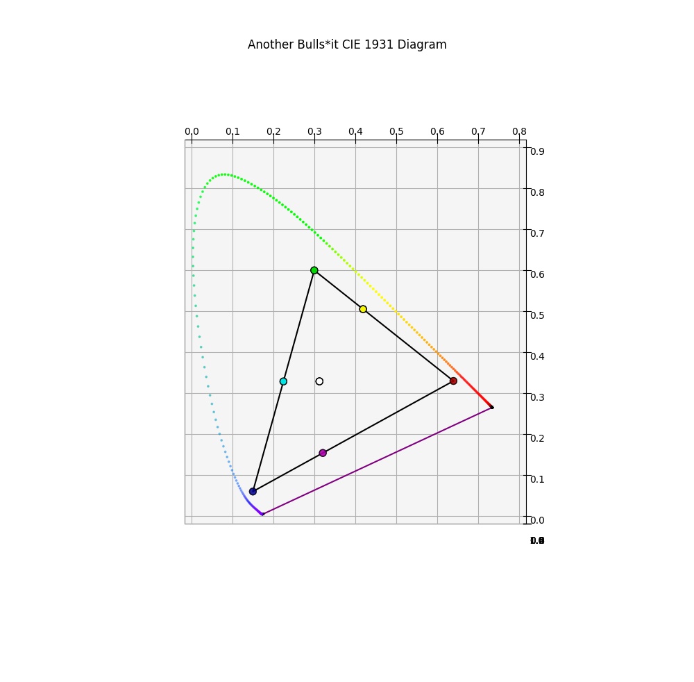
The tips of our triangle have small colour coded sRGB red, green, and blue dots, we introduce the other three members of the Notorious Six, being sRGB cyan, magenta, and yellow.
For a bit of a mental game, let’s pretend we are dealing with only sets of five intensity increments for our sRGB display linear light output. That is, let’s set those lights in the above combinations to 100%, 75%, 50%, 25%, and a low value near absolute 0%. For this purpose, we are going to remove the sRGB transfer function so we are dealing with linear energy ratios only. Any idea what they might look like if we were to plot them in 3D? Wait no longer!
Of particular note is that within the confines of sRGB, the Notorious Six member sRGB purely saturated “yellow” happens to also have the highest level of perceptual energy. The reason why is that the chromaticity coordinate for the equal energy mixture of green and red results in the highest luminous efficacy, being closest to the magic wavelength 555nm, which packs the most perceptual energy punch!
Also notice the perfectly vertical “legs” for each of the purely saturated Notorious Six members. The vertical “height” is maxed out at a certain point, and the purely saturated primaries and mixtures between cannot become more luminous, as they are expressed at 100% relative to the others! That means that again, rehashing what was covered in Question #12, the chromaticities do not output the same amount of perceptual energy at equivalent radiant energy.
If you have forgotten any of the yawn inducing concepts around intensity, feel free to revisit Question #12.
Alright… that’s a large enough of a dose of colour science for one day, I’d say. Let’s tidy this question up with an answer…
Answer #18: The missing axis when looking at the CIE 1931 chromaticity diagram is luminance, expressed as an uppercase Y.
So there you have it. Remember that in colour science, terms and little details such as uppercase or lowercase often carry additional meaning. In this case, the CIE 1931 chromaticity diagram uses the lowercase x and y to represent normalized, or scaled from 0% to 100%, values. If they were not scaled, you would read uppercase X and Y! And that brings one more puzzle piece to the table with clarity; the three dimensional models we have been plotting are in xyY, where Y represents the unscaled version of y. Y is also the bass player in the death metal act known as XYZ, and occasionally plays in his drill rap act offshoot known as xyY. He’s the same band member, and lowercase y is his little sibling.
Hopefully by examining the non-uniform perceptual energy vertical axis and the non-perceptually-distributed chromaticities in conjunction with the spectral locus itself has helped cement some of the previous concepts covered.
What’s interesting is that all of the above work is curiously plotted using a 0% to 100% framework though, and for you rendering wonks and photographers out there, you probably may have yet more questions that have become aware to you. But those will have to wait for a while…
1 There are indeed several versions of the Colour Matching Functions, and it’s worth noting so here now that you have a firm understanding of the groundbreaking 1931 version. There have been iterations since then that have attempted to more accurately model the standard observer response to visible light spectra, and “fix” certain problems with the 1931 model.
2 Adapted is an absolutely critical idea here that we will explore later. The reason that adapted is crucial, is that it allows us to discuss our psychophysical response in terms of a ratio from the darkest to the lightest value we have adapted to. Otherwise our scale will change. And yes, rendering wonks or photographers might be generating more questions right now because of that, and rightfully so!

5 replies on “Question #18: What the F*ck is the Missing Axis in a Chromaticity Diagram?”
“we have been plotting are in xyY, where Y represents the unscaled version of y”. You lost me a bit here. It is understandable that the yellows have a higher perceptional luminosity (Y) than the greens. However, why is it that the greens have higher y (lower case) values?
If Y is the unscaled version of y, doesn’t it hold that is a chromacity A has a certain y value higher than a chromacity B, the Y value of chromacity A will be greater than the Y value of chromacity B?
LikeLike
Great question. Thanks for asking…
This is a bit of a perplexing question it would seem.
First, the normalization of the CIE xy coordinates is achieved by *total sum* of the CIE XYZ signal; for each component, take the component and divide by the total sum of the XYZ signals.
Second, there’s a hidden little piece that is often overlooked in the CIE xy model; the construction of an achromatic centroid. If we think of the outer perimeter line of the locus as a series of many samples of electromagnetic radiation, when those values are carefully gained with respect to their opponent spectra, the “tension” that results will locate the resulting coordinate at the achromatic centroid position. That is, for the Standard Observer CIE XYZ model, there is an implicit assumption of an achromatic centroid that resides at 33% balanced XYZ signal, or `~0.3333 x` and `~0.3333 y`.
We might make this a tiny bit clearer than the muddy nonsense of the CIE xy model of meaningless metric by thinking about the BT.709 case. In BT.709’s system, we know that the “red”, “green”, and “blue” primary are carefully “balanced” such that when the properly balanced ratios are gained equally, that we hit the achromatic centroid of D65. That means that the three channels are not arbitrary in their intensities, but rather carefully engineered such that when R=G=B, we hit that achromatic centre. This is the same idea behind the Standard Observer Illuminant E model.
So while the “green” channel is indeed the most luminous of the three primaries, think about what happens when we set the “green” *and* the “red” channel to equal proportions of this underlying balanced gain. We end up with the luminance ratio of the “green” at 71.52% *combined* with the luminous ratio of the “red” at 21.26% for a combined whopping 92.78%. And that whopping 92.78% of luminous “yellow” is counteracted by a pathetic 7.22% luminous force of the “blue”. How can that be? Because in terms of lower order visual cognition, the “strength” of force of a given stimulus is quite irregular in our visual cognition pathways. In this case, the shorter wavelengths are *incredibly* powerful when compared against the 570nm region sensitivity for example.
Hope this helps… The CIE xy model is a horrifically meaningless projection, because all sorts of incorrect inferences arise from our inability to resist “reading the map” as though it represents some territory. Sadly, the confusion over the details of the projection are extremely common, with many incorrect inferences being made over a misunderstanding of the how the projection was designed and the implicit assumptions within it!
LikeLike
Hi. I love the irreverent way you’re explaining these things. Thanks!!
I’m till hung up on the sRGB triangle example in the “Another Bulls*it CIE 1931 Diagram”. There are several on-line videos describing Chromaticity diagrams in which it is stated that an equal mixture of any two points would be located as a midpoint of a line between them. Obviously not true if you look at the sRGB triangle where the Y and M are off center.
Question 1: But I guess I can still draw a line through the white point from any triangle Primary point color to the other side and get the complementary color, correct?
Ok, So I can do this for example, from Blue through White to Yellow. Yellow is also the result of equal mixing of Red and Green.
Question 2: So complementary colors of the Primary Colors are also the equal mixture colors of any two sides of the triangle, correct?
I like your analogy of an iphone map where altitude as another dimension of distance is not shown (so 1 cm compared to the next cm on the 2D map dont have the same distance). The “sRBG Intensities at 25% line increments” video shows me , for example, the “altitude” of the secondary color Y relative to the Primaries R and G.
Question 3: But I’m still confused as to how I can measure (can I?) equal distances between R and Y and G and Y from this video. By using the picture at :17 of the video, how can I explain the flat triangle Y location (which is not in the middle of line R-G). My issue might be that I dont really understand what is meant by equal light mixing.
Thanks in advance for clarifying !
Regards,
Waleed
LikeLike
Some great questions.
> Obviously not true if you look at the sRGB triangle where the Y and M are off center.
Solid observation. It should be noted how we look at “maps” and infer meaning from said maps. In this case, the CIE xy diagram represents a normalized over sum “signal”, and that normalization does indeed distort the inferred and expected equi-distances.
> Question 1: But I guess I can still draw a line through the white point from any triangle Primary point color to the other side and get the complementary color, correct?
As long as we caution ourselves and realize that the CIE xy diagram is a “stimulus” specification, not “colour”, as colour is cognitive, the assumption is somewhat correct!
Tracing a straight line will trace through points of stimulus that, when properly adjusted in terms of magnitude, will yield any point along the straight line in terms of colourimetric coordinates. However, it is important to note that “equal” does not mean “equal magnitudes”, as the visual cognitive apparatus has a lower order response that varies across the frequency of light. That is, for example, short wave frequencies are *incredibly* forceful, and require low magnitudes to counter the wavelengths around 570nm for example, which are incredibly “weak”.
> Ok, So I can do this for example, from Blue through White to Yellow. Yellow is also the result of equal mixing of Red and Green.
Correct. The assumption is that when summed together, the infinite series of points about the triangle will sum to a global frame of achromatic.
But as per above, be incredibly careful when stating “equal”; the underlying magnitudes will never be equal in terms of a current for example, as the visual cognition system is incredibly unique in the lowest order responses to radiation.
> Question 2: So complementary colors of the Primary Colors are also the equal mixture colors of any two sides of the triangle, correct?
Any two points in the stimulus specification will, depending on magnitudes of the mixture, arrive at another point on the straight line. Due to the projection of the CIE xy diagram however, many inferences are incorrect beyond that.
This is also why, for example, at maximal magnitude, BT.709 red, which carries a luminous quantity of 21.26%, and BT.709 green carrying a 71.52% quantity, sum to that bisection yellow point at a quantity of 92.78%; sum the quantities.
> Question 3: But I’m still confused as to how I can measure (can I?) equal distances between R and Y and G and Y from this video. By using the picture at :17 of the video, how can I explain the flat triangle Y location (which is not in the middle of line R-G). My issue might be that I dont really understand what is meant by equal light mixing.
Short answer is that with the CIE xy projection, you *cannot achieve this*. There *is* a method to reproject the underlying CIE XYZ values into a map that can determine relative magnitudes, but this is a separate discussion.
And most importantly, always remember… all evidence points to visual cognition **not** working as outlined in this overly simplistic stimulus projection.
The utility of the CIE model is extremely limited, and amounts to more or less nonsense when we start to dissect the visual cognition system and how we form colour cognition.
LikeLike
Excellent… thanks.
LikeLike