
With the past several posts, the astute mind will have already arrived at the answer to the headline question here, so in an effort to add some value to the short answer of “There is no colour in the discrete scalar samples of stimuli”, let’s try to explore the surface of the problem with a degree of curiosity, and in doing so, perhaps elucidate something crucially important to visual cognition.
Question #33: What are the actual colours of the three RGB lights?
We already know that it would be a complete fallacy to discuss “colour of light” being “in” the energy outside of our meatware calculation engine. What we can discuss then, are the implications of the stimuli with respect to the display medium’s spectral energy output. If the notions around “colour” are not in the spectral energy, how does the spatiotemporal relationship play a significant role in this cognition of “colour”?
In this brief romp, we should think deeply about what a “gamut” is from the stimuli vantage, and more importantly, from the cognitive colour inference engine vantage.
Way back in Question #4 we were presented with the idea that the RGB normalized wattage values were typically connected to a “colour” of the radiometric energy by way of a display standard known as sRGB.
However, in the latter chapters starting around Question #30, we began to construct a mental model of the human visual cognition system as something more of a differential inference engine, where the colour is an inferred computation that emerges from an analysis of the spatiotemporal articulation of the energy fields; how the neurophysiological gradients lead to calculated and inferred “meaning”.
Why am I bringing this discussion up in what apparently should be a discussion around colourimetric stimuli definitions of “gamut”? The answer has to do with what we have slowly been building toward. In the form of a question, we might ask…
Question #33: How can a “gamut” of colours exist if our neurophysiological mechanisms are broadly differential, comparative, and modulating at the biological level?
The answer is one that I suspect most readers are already likely finding hints of inconvenient “truths”. If our visual assemblies are differential1, the implication is that there’s some sort of mediating regulation and “orienting” system at work. The “absolute” values of radiant energy hold little sway over our cognition if our systems are keenly adapting on the fly to the presented articulations, or the spatiotemporal “arrangement” of the signal energy.
Do we have any evidence to hammer this point home? The answer is of course a resounding yes!
In a canonical piece of research, Brown and MacLeod noted that the appearance of a colour’s “chroma” or “saturation” was predicated upon the articulation of the field the form is embedded in.2 Later, minds such as Ekroll, Faul, Wendt, Anderson, Ratnasingam, and many, many others have explored this territory with a greater degree of scrutiny.
Here I have replicated one of the Ekroll and Faul demonstrations3 of the Gamut Expansion and Contraction effect4. The tristimuli of the “discs” is identical between the two pictures, yet our cognition of the computed and inferred “colourfulness” of the discs vary5. In the first low spatial variegated version, the discs appear more “colourful”. In the highly articulated picture, the discs are less “colourful”. Some may cognize that there may appear subtle variations in their cognition of “hue” and “value” as well.


Most of the readership at this point is probably interested in this cognitive effect, and perhaps are wondering how such a mechanic may work in the meatware world of biology. Is there a broad and reasonably simplistic handle that we can employ to hold a thread of understanding here?
One line of reasoning is that we have a dynamic “gain regulation” that operates across many regions of our cognition, from the retinal assemblies on up to the higher order mechanisms of our Lateral Geniculate Nucleus and onward to the Visual Cortex. That is, that somehow our visual cognition system “discounts” or “separates” varying “contrast” neurophysiological gradients via a broader gain regulation system6. Carandini, Heeger, Movshon, and Tolhurst, via torture research on cats and primates, have located a normalization at work78. Carandini and Heeger go on to call this sort of gain regulation leading to normalization as a “canonical neural computation”9:
There is increasing evidence that the brain relies on a set of canonical neural computations, repeating them across brain regions and modalities to apply similar operations to different problems. A promising candidate for such a computation is normalization, in which the responses of neurons are divided by a common factor that typically includes the summed activity of a pool of neurons. Normalization was developed to explain responses in the primary visual cortex and is now thought to operate throughout the visual system, and in many other sensory modalities and brain regions. Normalization may underlie operations such as the representation of odours, the modulatory effects of visual attention, the encoding of value and the integration of multisensory information. Its presence in such a diversity of neural systems in multiple species, from invertebrates to mammals, suggests that it serves as a canonical neural computation.
Thus, yet again, we are faced with the cold hard reality that colour, in terms of the Munsell inspired constructs10 of Hue, Value, and Chroma, or more abstract notions around “contrast”11, cannot be qualitatively understood or communicated using a stimuli wattage unit specification!
“But… but… but… these are edge cases!111!!!” I can hear the zombies of the USS Colourimetric Titanic WANKers screeching…
In fact, one can make a case that this cognitive machination of a dynamic gain regulation is so prevalent, so omnipresent, that even our casual perusal of social media pictures engages our frictionless colour cognition at every waking moment. In fact it seems that this dynamic gain regulatory system could be incredibly important in the decomposition12 of forms.
Here’s a very simple picture found on social media, from bogat23k. Using your “mind’s eye”, take a moment to estimate what the door colour is.

Of course, very few folks are pathological, and likely aren’t going to pixel scrub the discrete scalar samples of stimuli. Most folks, including authors very much like you would adjust the picture, settle on “It’s a pale blue”, and move on.
But what if we did sample the discretized stimuli and pull them out of the articulation? Would we be able to find this colour we cognized?
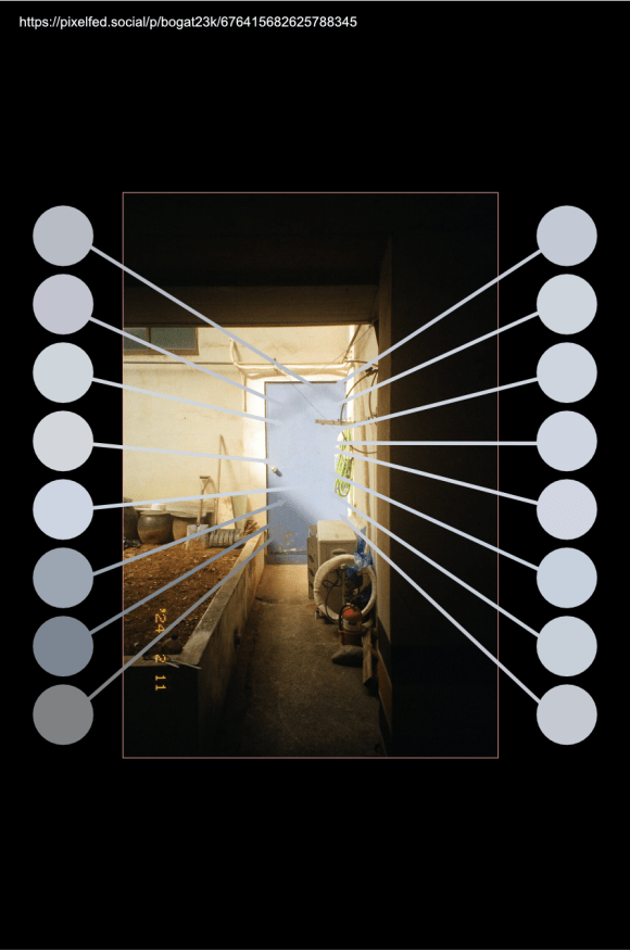
Here I’ve sampled a good smattering of discrete pixel stimuli intensities, and isolated them in an increment orientation toward the sides of the depiction. We can get a sense that the colour we effortlessly thought we passively “saw” in the stimuli, is simply nowhere to be found! It turns out that for most folks no satisfactory “match” can be derived, regardless of which stimuli sample we choose. For many folks, none of the swatches carry the cognition of “blueness” that is present in the articulation of the door.
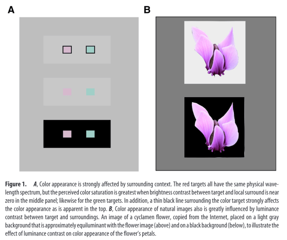
Xing et al13 noted a strong correlation between the “surrounding” stimuli in terms of luminance variegation polarity and the cognition of colour.
The interaction between brightness and color causes there to be different color appearance when one and the same object is viewed against surroundings of different brightness. Brightness contrast causes color to be desaturated, as has been found in perceptual experiments on color induction and color-gamut expansion in human vision.
Dynamic gain regulation could very well be one of the forces at work here, scaling our neurophysiological signals, stretching and contracting the cognitive “sense datum” into what we ultimately analyze to compute and infer form colour from!
You might be wondering where all of this leaves sRGB, BT.709, BT.2020, “wide gamut”, “HDR”, and the rest of the acronyms and buzzwords around pictures. If the research shows a trend toward some sort of gain regulation and / or normalization around visual cognition, how then is colour cognition related to the differential neurophysiological gradients of these mediums? It’s an open question that I hope more people begin to ask themselves, as it is quite possible that the hype and marketing overreach of vendors and companies selling products and services is a disservice to a biologically tenable framing of visual cognition. Caveat Emptor; be vigilant in one’s wariness about what is being sold.
We originally answered Question #4 with a degree of shallow insight:
Answer #4: There is a good chance that the colours of the three primary lights in your display are darn close to the REC.709 red, green, and blue chromaticities.
At this point in our discussions, with our understanding of colour having been fleshed out into a more nuanced understanding based on top of biologically plausible mechanisms, we need to update that answer.
Answer #33: There is a good chance that the spectral composition of the three primary emitters in your display are darn close to the REC.709 red, green, and blue colourimetric stimuli specification standard. However, suggesting that there is colour, or a “colour gamut” within the stimuli volume of the three lights is a grave overreach of terminology when framed from a biologically untenable vantage.
In the coming posts, we will hopefully explore these general ideas further with a hope of gaining a stronger grasp on the fluidity of the visual cognition system, and the implications on the common vernacular of “gamut”, “primaries”, and other orthodox ideas central to picture making for the digital picture author.
- Westheimer G. The ON–OFF dichotomy in visual processing: From receptors to perception. Progress in Retinal and Eye Research. 2007;26(6):636-648. doi:10.1016/j.preteyeres.2007.07.003 ↩︎
- Brown RO, MacLeod DIA. Color appearance depends on the variance of surround colors. Current Biology. 1997;7(11):844-849. doi:10.1016/S0960-9822(06)00372-1 ↩︎
- Faul F, Ekroll V, Wendt G. Color appearance: The limited role of chromatic surround variance in the “gamut expansion effect.” Journal of Vision. 2008;8(3):30. doi:10.1167/8.3.30 ↩︎
- Ekroll V, Faul F, Wendt G. The strengths of simultaneous colour contrast and the gamut expansion effect correlate across observers: Evidence for a common mechanism. Vision Research. 2011;51(3):311-322. doi:10.1016/j.visres.2010.11.009 ↩︎
- Ratnasingam S, Anderson BL. The role of chromatic variance in modulating color appearance. Journal of Vision. 2015;15(5):19. doi:10.1167/15.5.19 ↩︎
- Gardner JL, Sun P, Waggoner RA, Ueno K, Tanaka K, Cheng K. Contrast Adaptation and Representation in Human Early Visual Cortex. Neuron. 2005;47(4):607-620. doi:10.1016/j.neuron.2005.07.016 ↩︎
- Carandini M, Heeger DJ, Movshon JA. Linearity and Normalization in Simple Cells of the Macaque Primary Visual Cortex. J Neurosci. 1997;17(21):8621-8644. doi:10.1523/JNEUROSCI.17-21-08621.1997 ↩︎
- Tolhurst DJ, Heeger DJ. Comparison of contrast-normalization and threshold models of the responses of simple cells in cat striate cortex. Vis Neurosci. 1997;14(2):293-309. doi:10.1017/S0952523800011433 ↩︎
- Carandini M, Heeger DJ. Normalization as a canonical neural computation. Nat Rev Neurosci. 2012;13(1):51-62. doi:10.1038/nrn3136 ↩︎
- Munsell AH. A Color Notation. G. H. Ellis co.; 1907. Accessed July 29, 2023. https://catalog.hathitrust.org/Record/000349968 ↩︎
- Burr DC, Ross J, Morrone MC. Local regulation of luminance gain. Vision Research. 1985;25(5):717-727. doi:10.1016/0042-6989(85)90178-6 ↩︎
- Anderson BL, Khang BG. The role of scission in the perception of color and opacity. Journal of Vision. 2010;10(5):26-26. doi:10.1167/10.5.26 ↩︎
- Xing D, Ouni A, Chen S, Sahmoud H, Gordon J, Shapley R. Brightness–Color Interactions in Human Early Visual Cortex. J Neurosci. 2015;35(5):2226-2232. doi:10.1523/JNEUROSCI.3740-14.2015 ↩︎

2 replies on “Question #33: What the F*ck are the Colours of the Three Lights?”
Oh my goodness, I thought this whole thing was finished. I didn’t expect a new one to pop up! It all still has been an interesting read (And the language is quite engaging, to be honest). Comprehension… not so much, but that’s a me problem.
Looking forward to what more there could be. I’m curious if you have any sort of planner on everything you want to put here, and if so, how many more questions could we expected? If it’s not determinable, that’s okay, too, I’m just wondering how much else is there to explore.
LikeLike
> I’m just wondering how much else is there to explore.
Given no one has an even vague workable model of visual cognition, and fewer still are even aware of just how contested the entire surface is, I would think there’s quite a few more to go. Author willpower notwithstanding…
> I’m curious if you have any sort of planner on everything you want to put here, and if so, how many more questions could we expected?
I have decided to step back over some of the Colourimetric World View and want to reconcile this stimuli-centric world view with a much more tenable, and biologically grounded, lens.
The tricky part is finding and researching demonstrations that are compelling enough to shake people free of the colourimetric octopus. In the end, this is really an attempt to draw us away from thinking about colour as “out there”, and reorienting it toward a far more biologically salient stream of incredibly active cognitive inferential computations.
As far as I am concerned, this is the only salve for not only beating back the corporate nonsense of Stuff That Does Not Work, as well as hopefully getting more minds to drop the assumption that colour is “solved”, let alone “not even barely workable”.
For picture authors, this is an incredibly important point for me. I dislike the idea of some authoritative number fornicator peddling colourimetry-as-colour leading to authors second guessing their very real cognitions.
The systems don’t work. And worse, they stink. And worse than worse, they become more and more ubiquitous with every passing moment if there is no sufficient friction.
If these posts aid folks in that friction, by way of questions, examples, and informed citations? Hell… that is a win.
TL;DR: Expect more dull rehashing of older posts. This is a content mill. Got to keep the millions of clicks rolling in…
Thanks for visiting.
LikeLike